Deep dives
The Problem
Arc7’s onboarding was bleeding users, but fixing it wasn’t as simple as just “making it shorter”. The redesign needed to:
- Drastically reduce the drop-off rate on complex data-entry screens
- Balance the business hypothesis of a “fast” funnel against the users’ psychological need for a “thorough” health assessment
- Ship iteratively so Engineering and PMs could measure the exact impact of sequence changes via rigorous A/B testing
My optimization strategy was twofold. First, I prioritized the low-hanging fruit first: resolving immediate usability bottlenecks. Once the baseline was stabilized, I turned to a larger data-driven hypothesis that our onboarding was simply too long and set up rigorous user testing to verify if length was actually the problem.
Design Audits: The Lower-Hanging Fruit
To kick off the optimization process, I started by conducting a comprehensive design audit (including a cognitive walkthrough) on the current flow to fix existing usability issues . Fixing usability issues is often the lowest-hanging fruit to optimize the conversion rate before making larger structural changes. By tracking data, I pinpointed pages with high jump-out rates and abnormal Page Visit to Unique Visit (PV/UV) ratios .
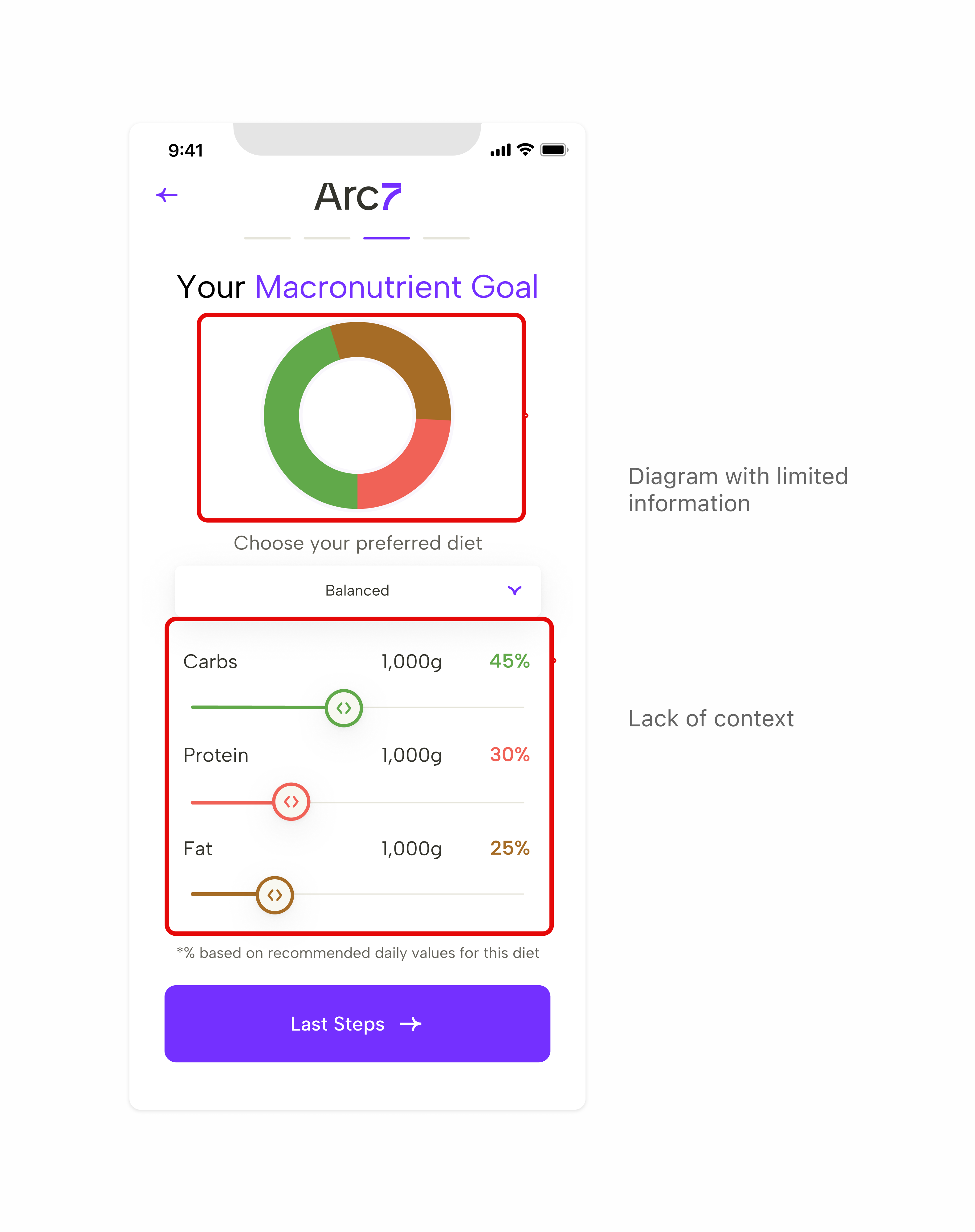
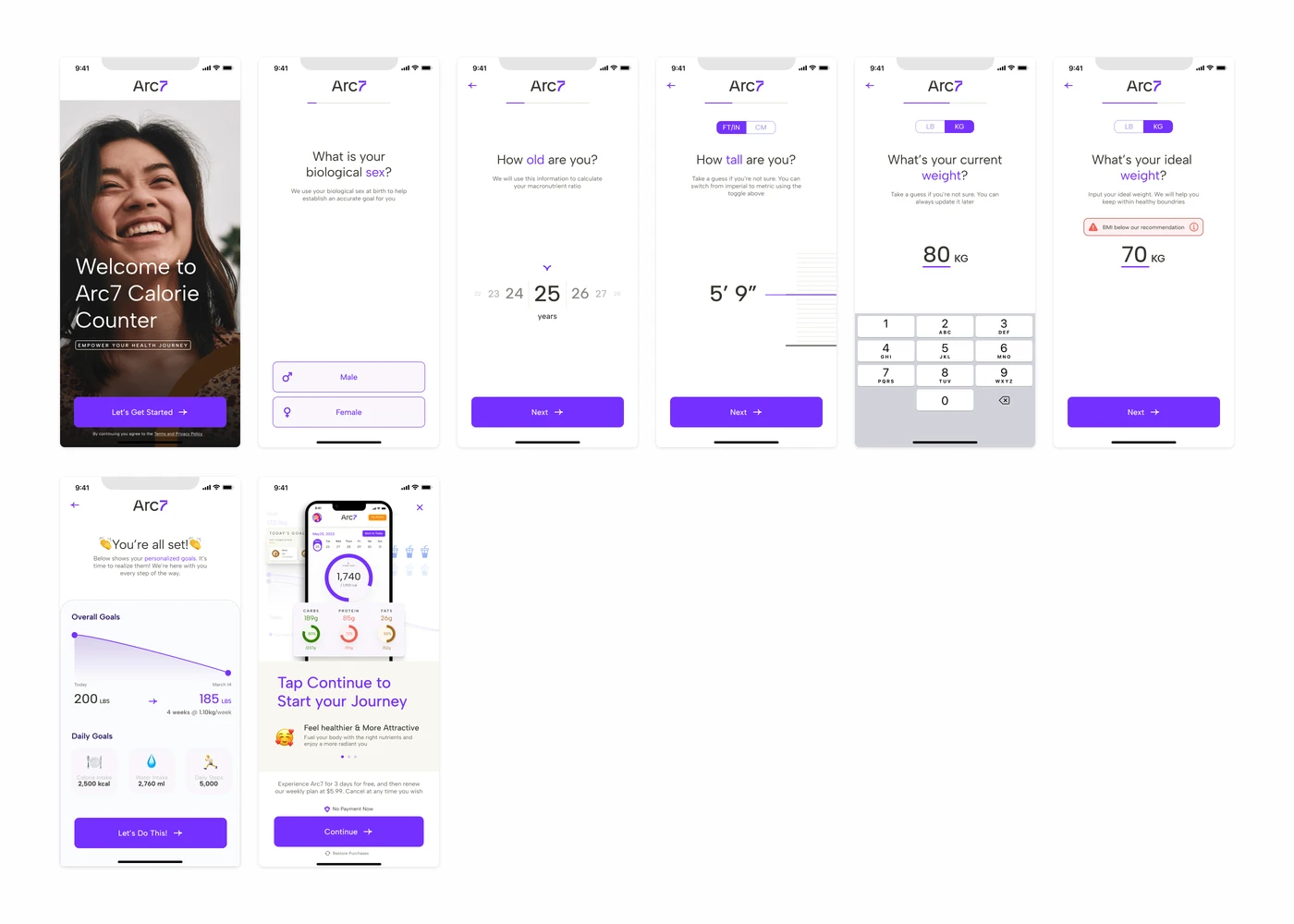
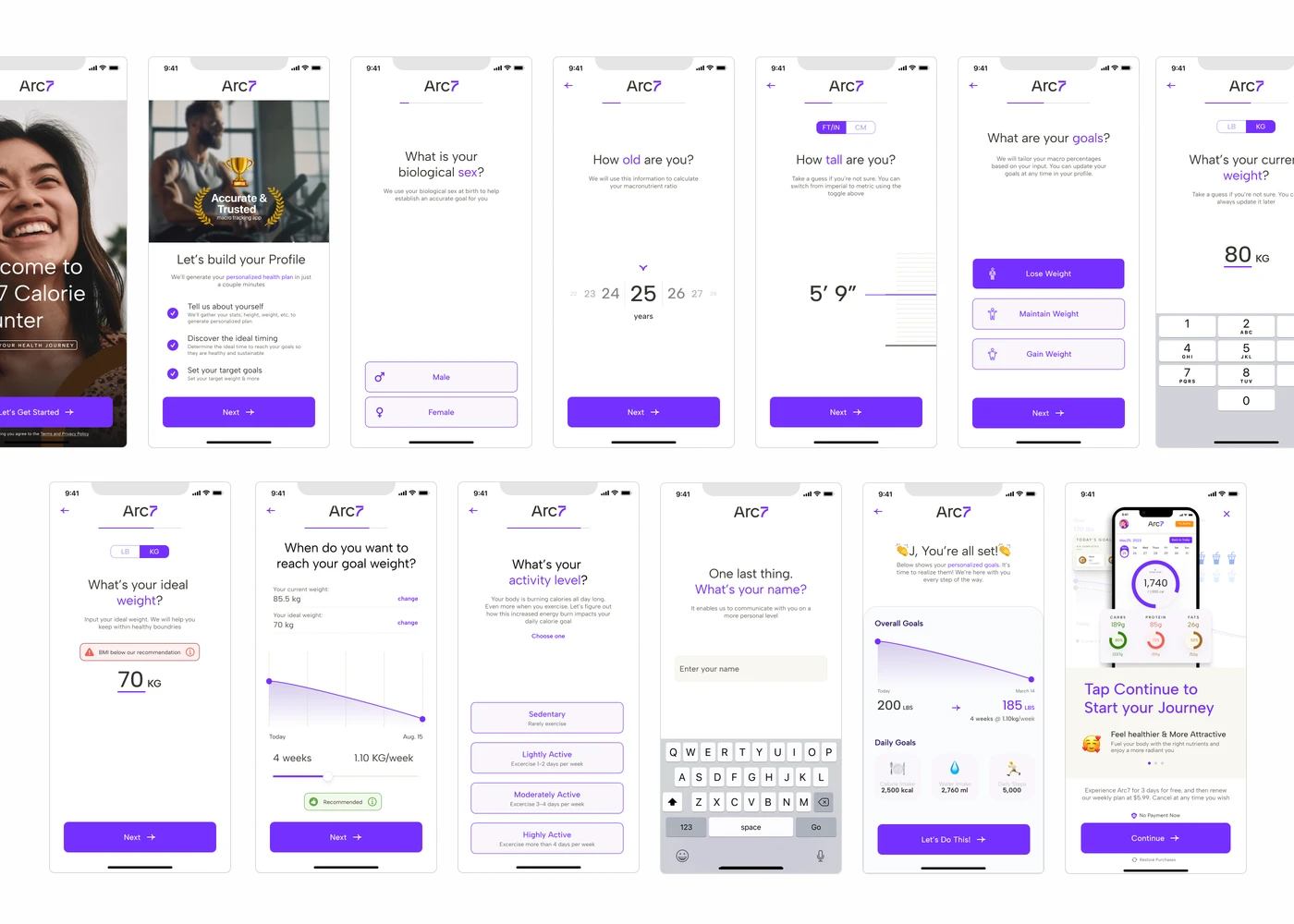
The Example - Diet Type Page
The “Diet Type” page is a perfect example of how I found and fixed these issues. Data tracking showed it had a highly disproportionate PV/UV ratio of around 138%, indicating severe usability blocks . A cognitive walkthrough revealed a heavy visual load caused by a pie chart that acted as a placeholder rather than providing useful information, and a structure that contradicted the user’s mental model.
The solution
I removed the pie chart to reduce visual load and restructured the page layout . I then adopted a flow of: Diet Type -> Pre-set Macronutrient Goal -> Detailed Percentage, better aligning with users’ behaviors.
← Before
Heavy visual load — pie chart acts as placeholder, structure contradicts user mental model
Your Preferred Diet Type
- Balanced
- Keto
- Vegetarian
- Mediterranean
- Vegan
- Paleo
All diet information can be found here
Your Preferred Diet Type
Here are macronutrient goals based on the recommended diet type
*% based on recommended daily values for this diet
Your Preferred Diet Type
*% based on recommended daily values for this diet
After →
✦ Working prototype — tap a tile to explore the redesigned flow
Validating Assumptions Via Usability Testing
I initially assumed the onboarding was too long. However, during 30-minute think-aloud usability testing sessions with 3 power users and 3 novice users, I discovered a discrepancy between user perceptions and data-informed assumptions. 5 out of 6 users felt the length was appropriate, anticipating an extended process for a diet app.
This discrepancy prompted me to initiate A/B testings with a revised version. This approach will help us determine the optimal length for OB without the influence of usability issues.
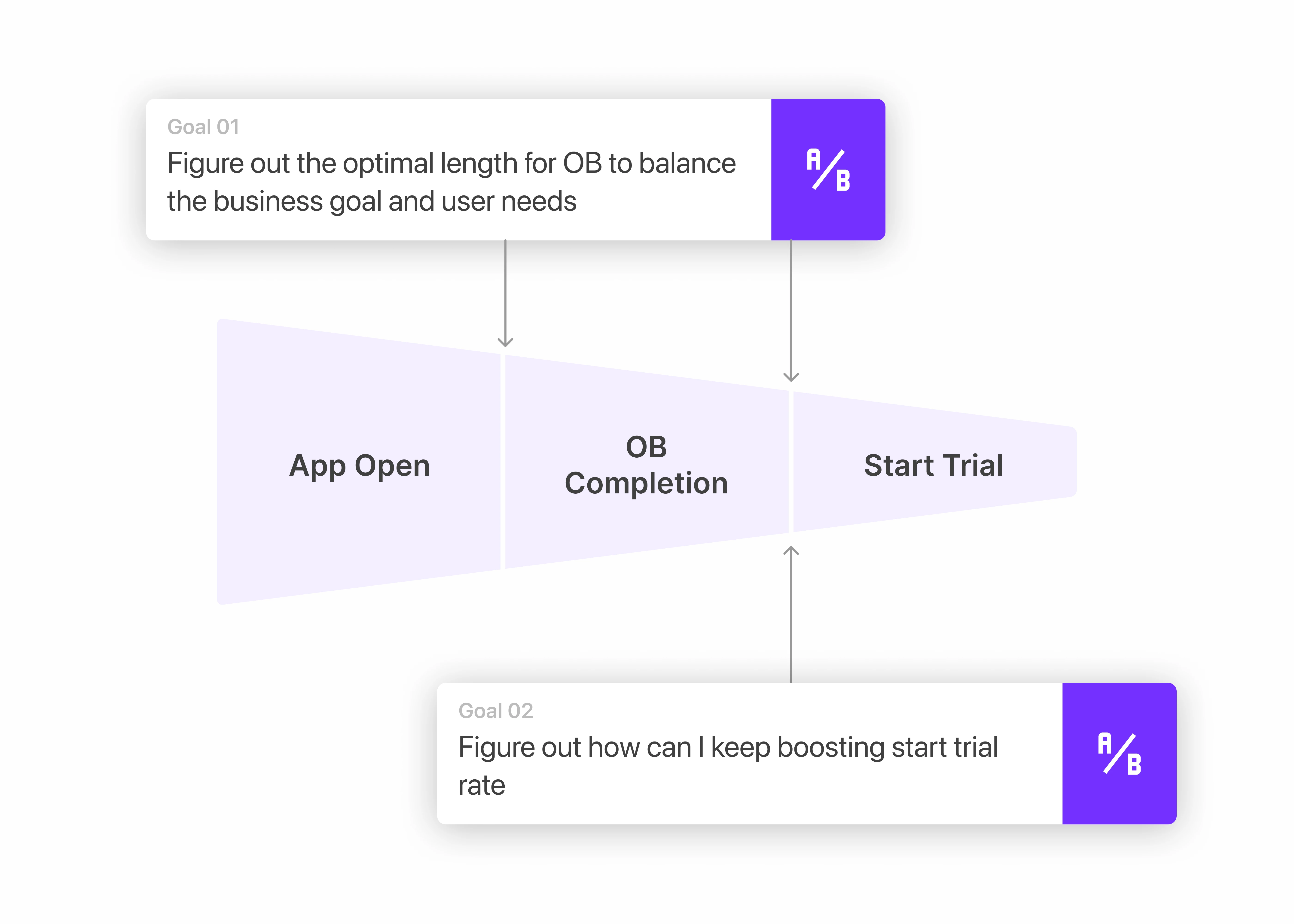
The Strategic A/B Testing Phase
Test 1 - About Onboarding Length
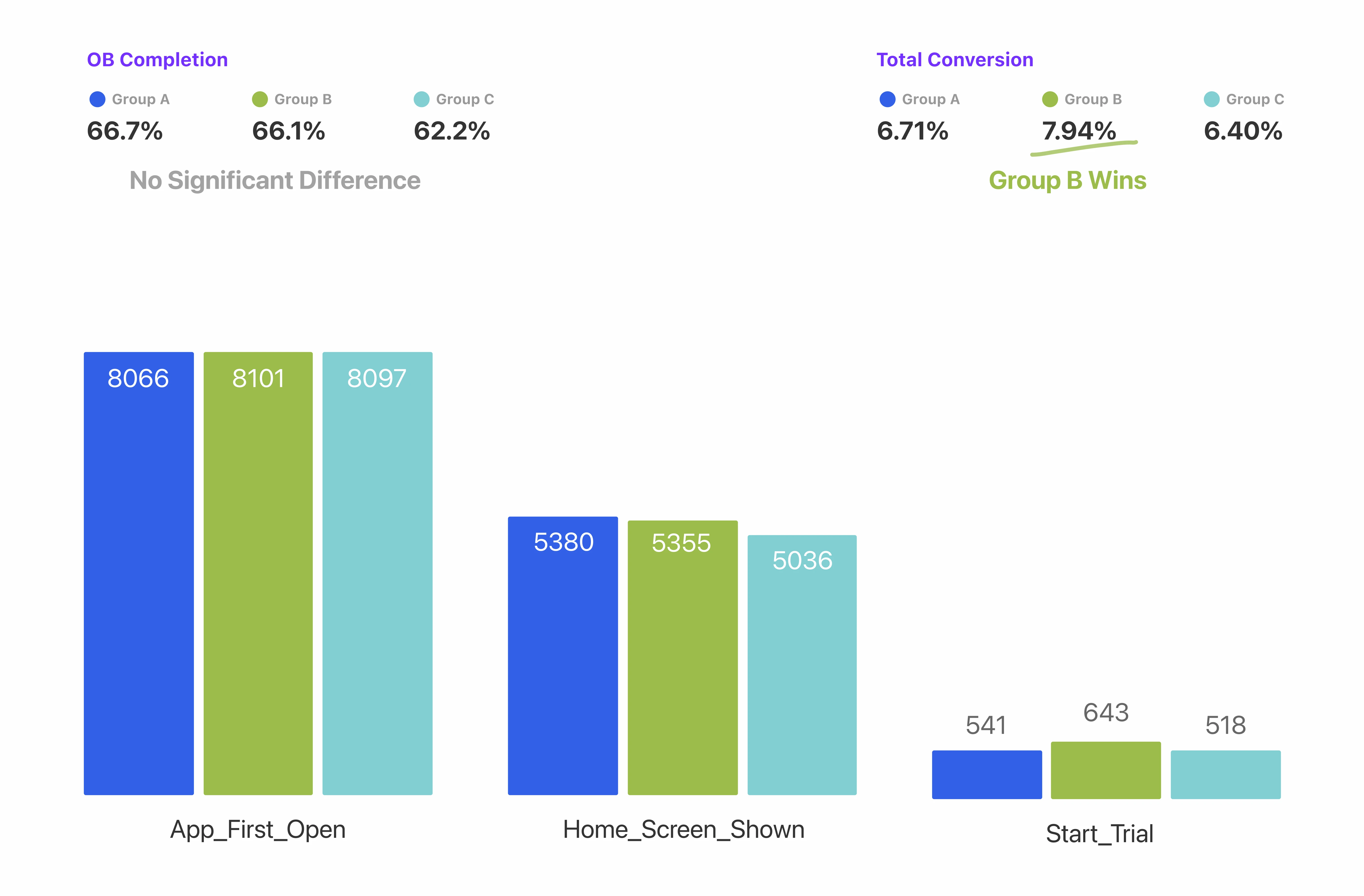
To determine the optimal length for the onboarding process, I designed a multi-variant A/B test comparing three distinct flows.
- Group A (8 pages) was a heavily streamlined flow inspired by a competitive analysis of top-performing diet apps on the market.
- Group B (13 pages) was a balanced flow directly informed by our qualitative usability testing, which revealed that users wanted more customization to ensure a personalized health plan.
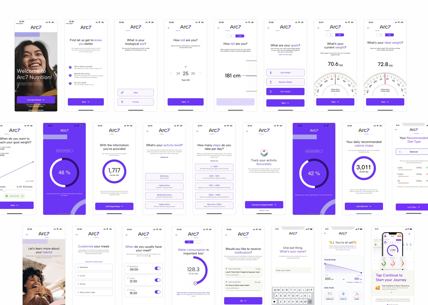
- Group C (25 pages) served as our control, retaining the original length for baseline comparison.
Heavily streamlined flow inspired by competitive analysis of top-performing diet apps.
Group B won the testing. After 3 weeks testing, there were no significant differences between Group A and Group B in terms of OB completion, but Group B won the total conversion rate with 7.94%
Test 2 - About Premium Pitch Placement
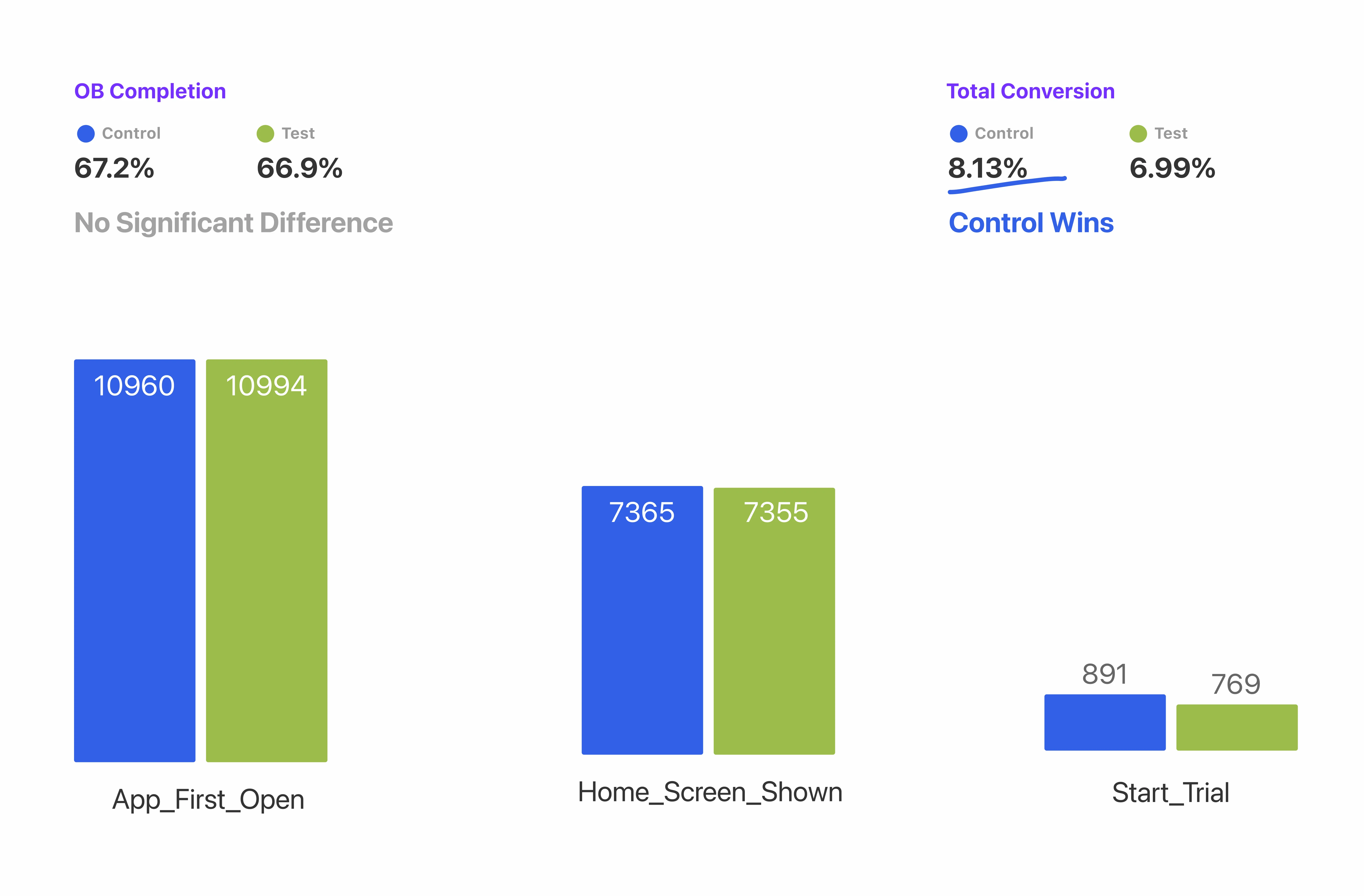
With the optimal onboarding length established, my next focus was maximizing the start trial rate by determining the most effective placement for the premium pitch.
- The Control group kept the premium pitch at the very end of the flow, operating on the hypothesis that allowing users to fully customize their health plans first would build investment and increase their intent to upgrade .
- Conversely, the Test group positioned the premium pitch immediately as the second screen. The rationale here was to prioritize visibility, ensuring a larger portion of users were exposed to the offer early on before any natural drop-off could occur .
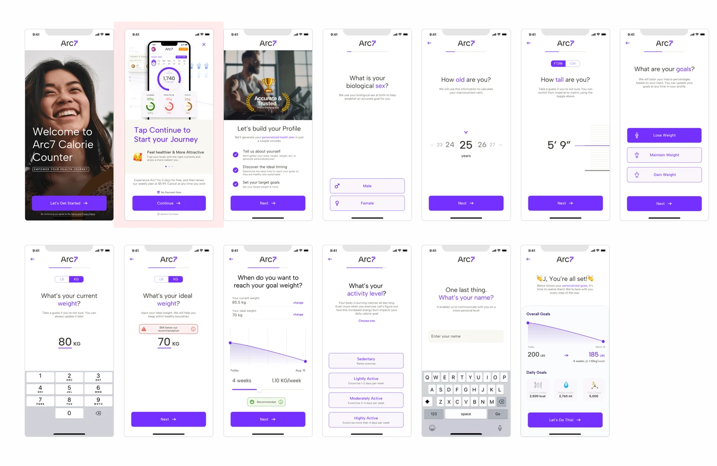
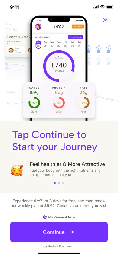
Premium pitch appears at the very end of the flow, after users have fully customized their health plan.
Surprisingly, the Control group (pitching at the very end of the onboarding) won with an 8.13% conversion rate, compared to 6.99% for the Test group which pitched it early. Users needed to feel their plan was fully customized before they had the intent to upgrade.
Final Design
Onboarding
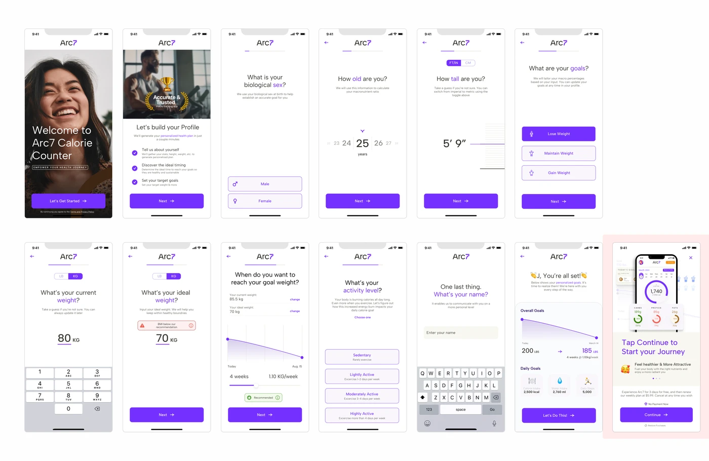
We concluded that extending the Onboarding (OB) slightly with additional input options would enhance conversion rate of starting trial for premium plan. The final 13-screen flow balances personalization depth with a streamlined experience informed by our A/B test findings.
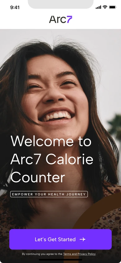
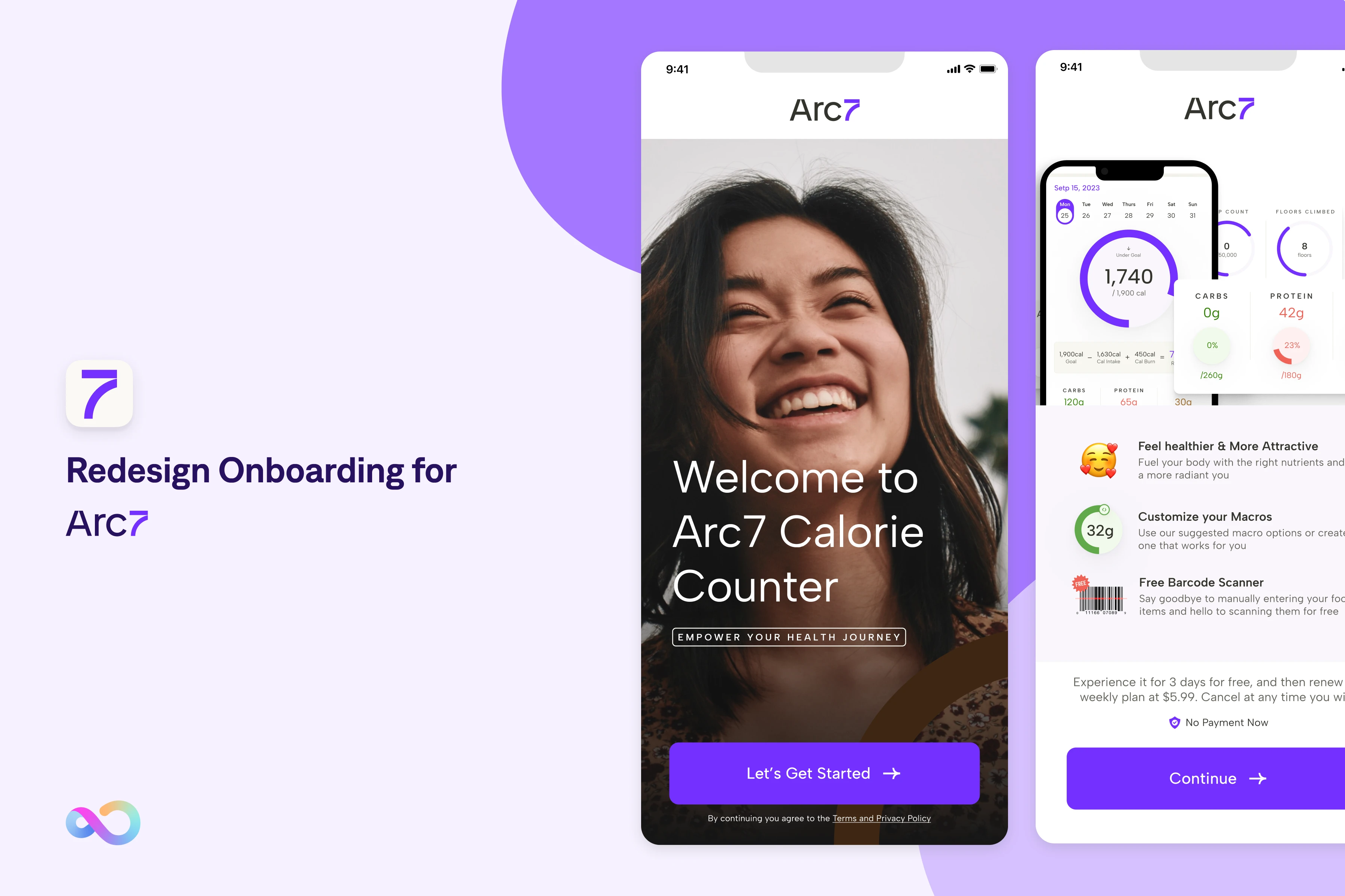
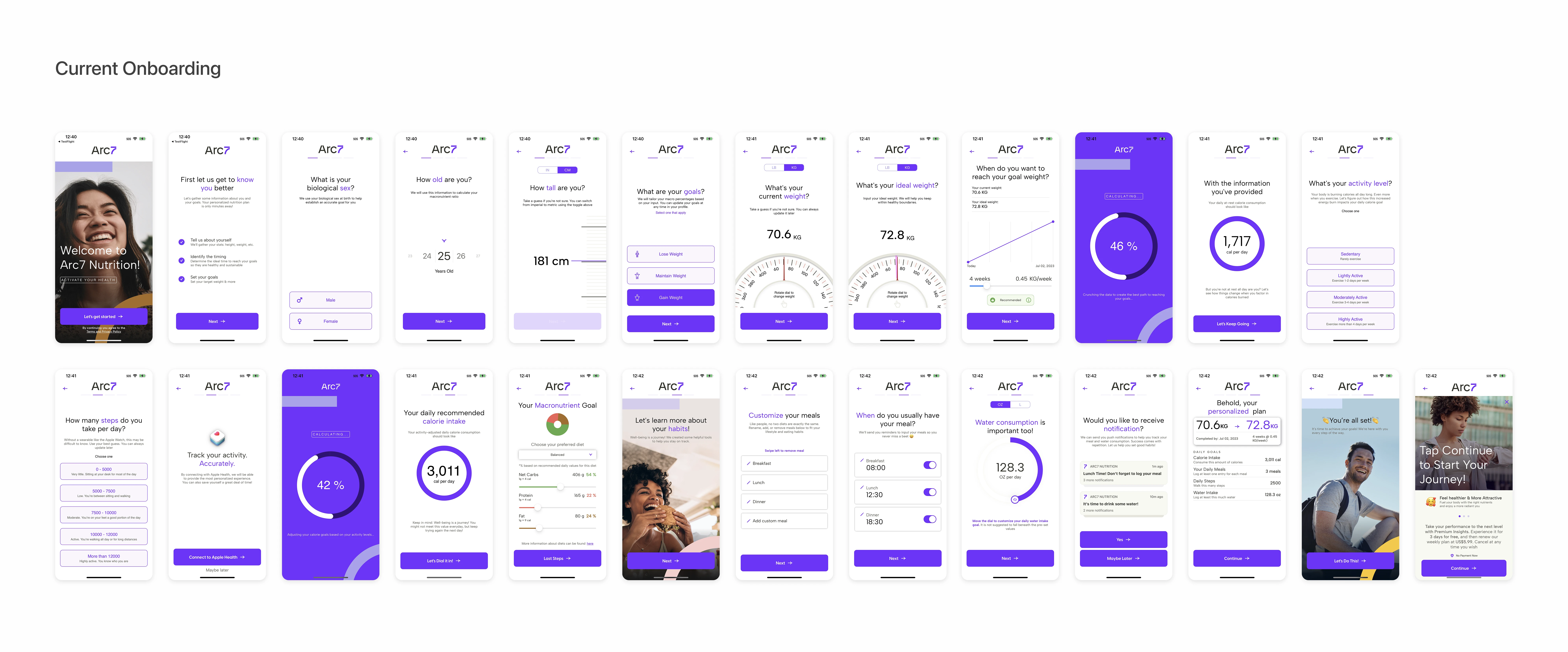
01 Welcome
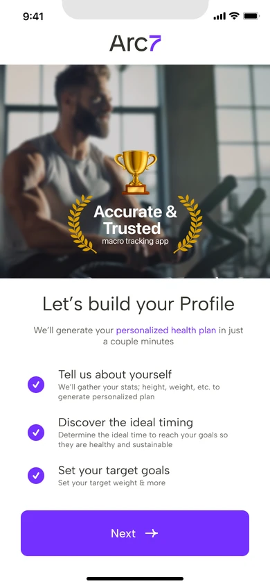
02 Social Proof
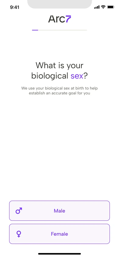
03 Biological Sex
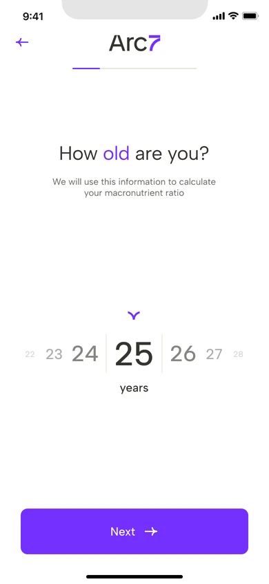
04 Age
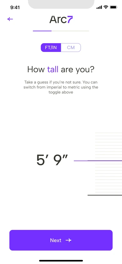
05 Height
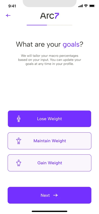
06 Goals
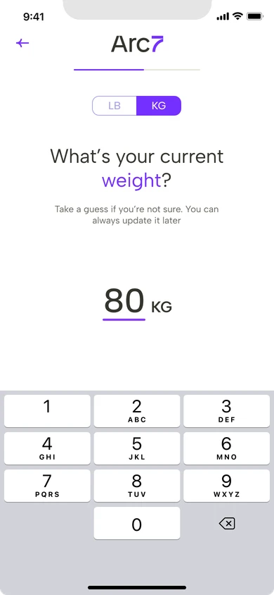
07 Current Weight
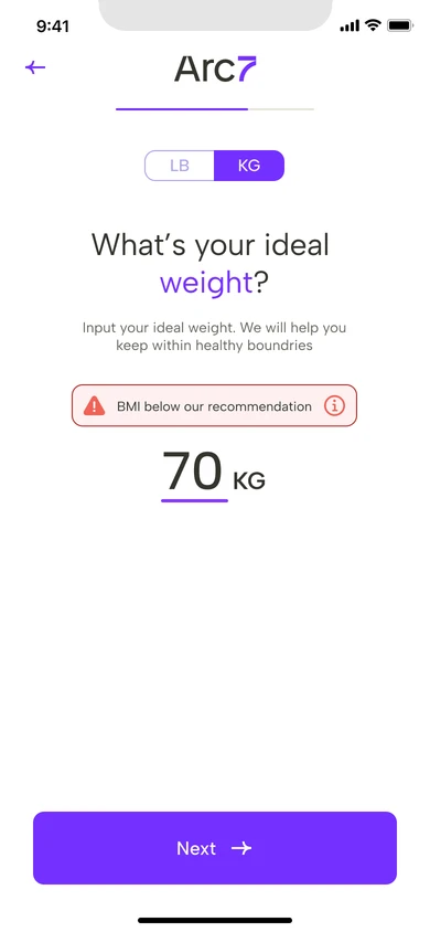
08 Ideal Weight
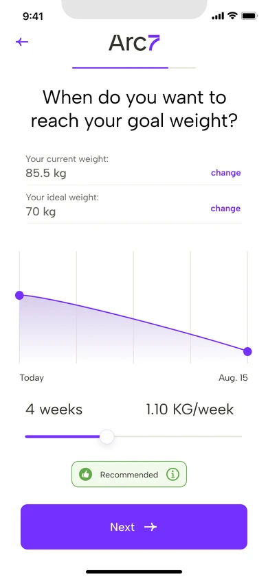
09 Goal Timeline
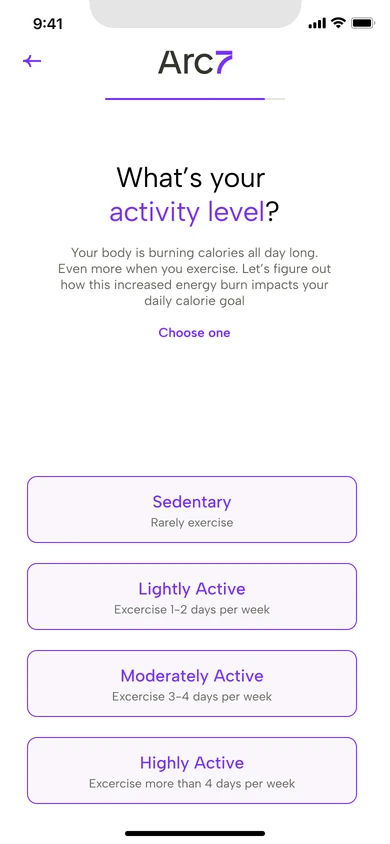
10 Activity Level
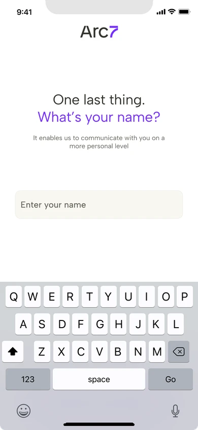
11 Your Name
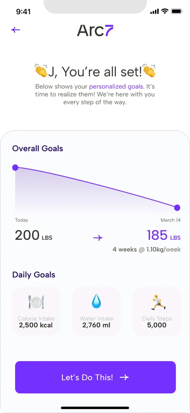
12 You're All Set!
13 Premium Pitch
In-App
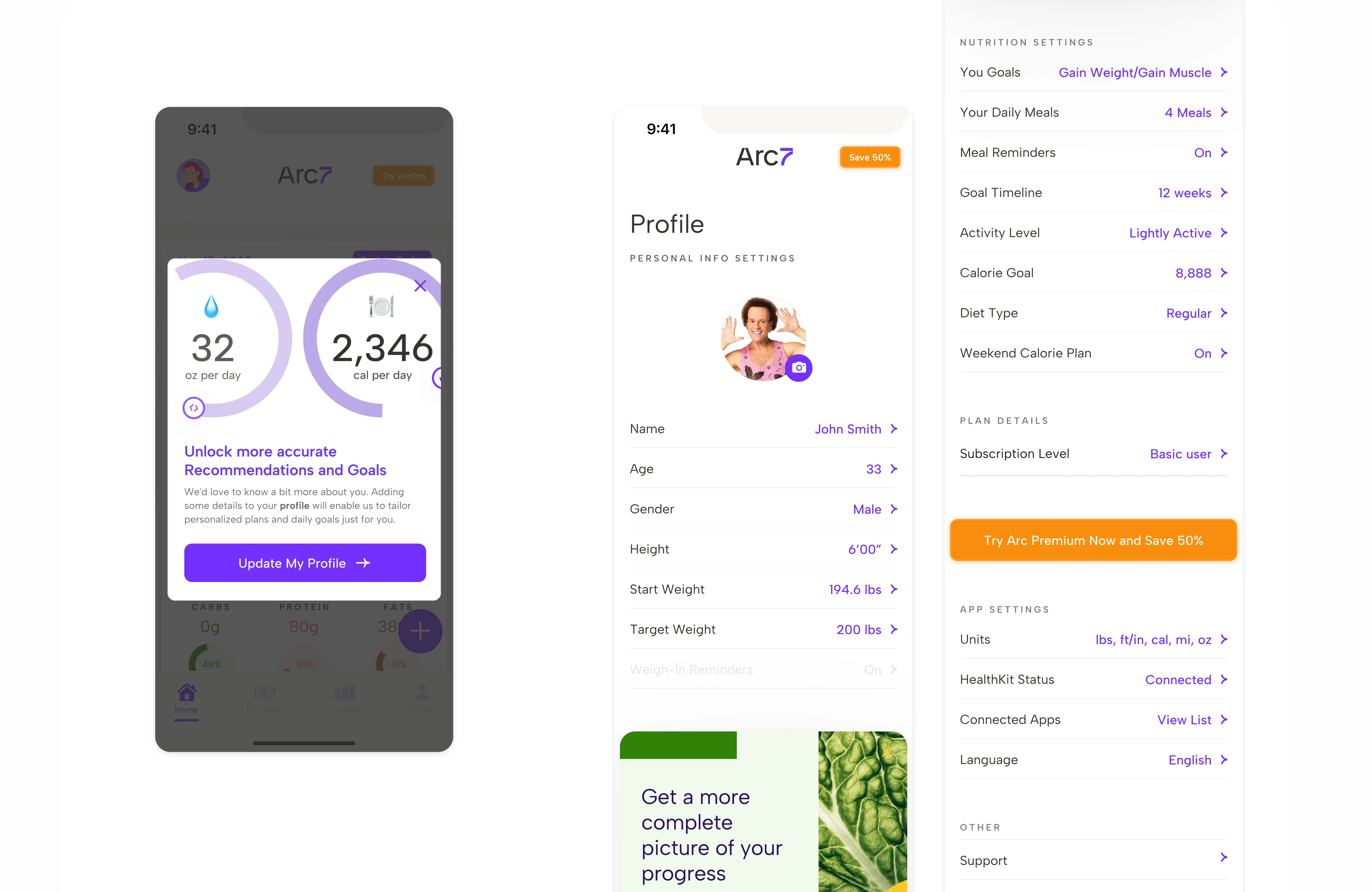
The remaining information collection will be moved to post-Onboarding, supported by a pop-up encouraging users to provide these details for a more personalized health plan.