Jingzhi.
Making Hiya's Mobile Design System AI-Native cover Featured
TL;DR Design SystemsAI-Augmented WorkflowsCross-Platform EngineeringAccessibility

Making Hiya's Mobile Design System AI-Native

An AI-native mobile design system with semantic tokens, shared components, and migration guardrails across Android and iOS.

The Problem

Hiya's mobile design system was still Figma-first. Styles were named by literal value instead of purpose, so every theming change meant auditing components by hand. It needed a machine-readable structure that designers, engineers, and AI agents could all build from.

The Result

0 → 1

An upgraded, AI-native design system built beyond Figma

Semantic tokens, shared components, agent-ready docs, and guardrails designers and engineers can use together

My Role

Design System Owner

Timeline

March 2026 – Present

Team

Design
Engineering

Company

Hiya

The Solution

Design system foundation
Brand

Brand

Hiya's icon mark and wordmark, with usage variants for light and dark surfaces.
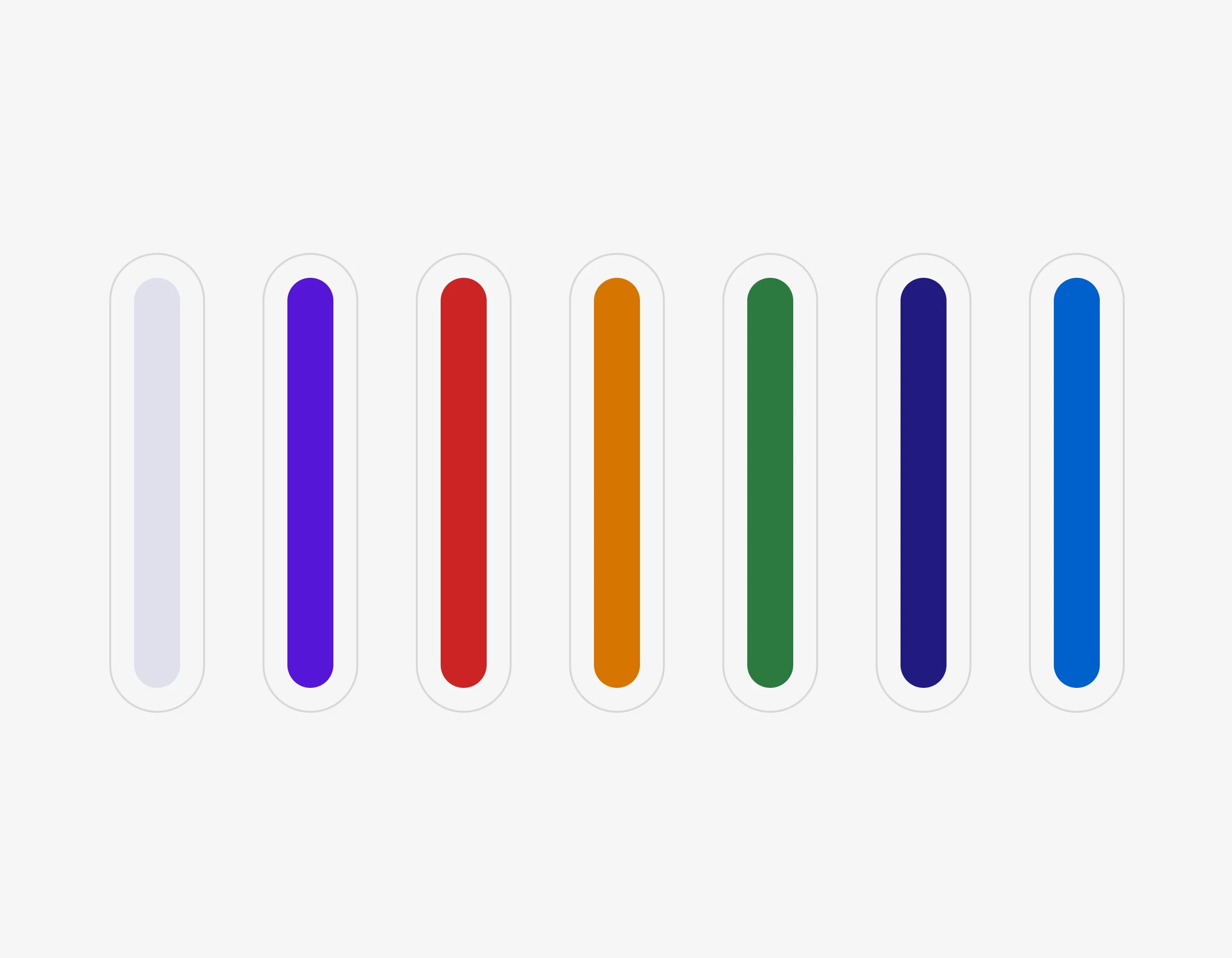
Color

Color

A semantic color system mapped from primitive value to purpose-bound token.
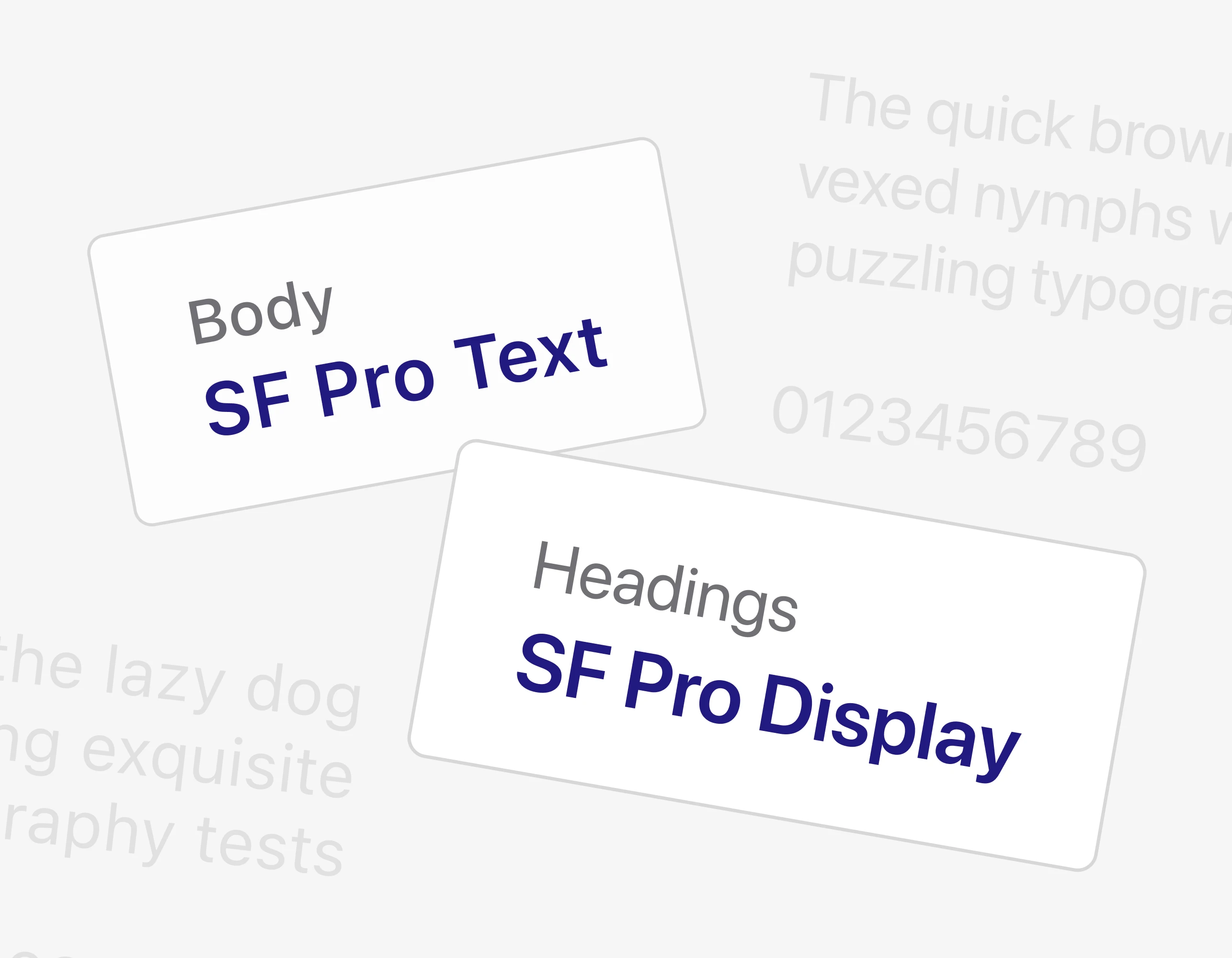
Typeface

Typeface

SF Pro Display for headings, SF Pro Text for body — one type ramp across both platforms.
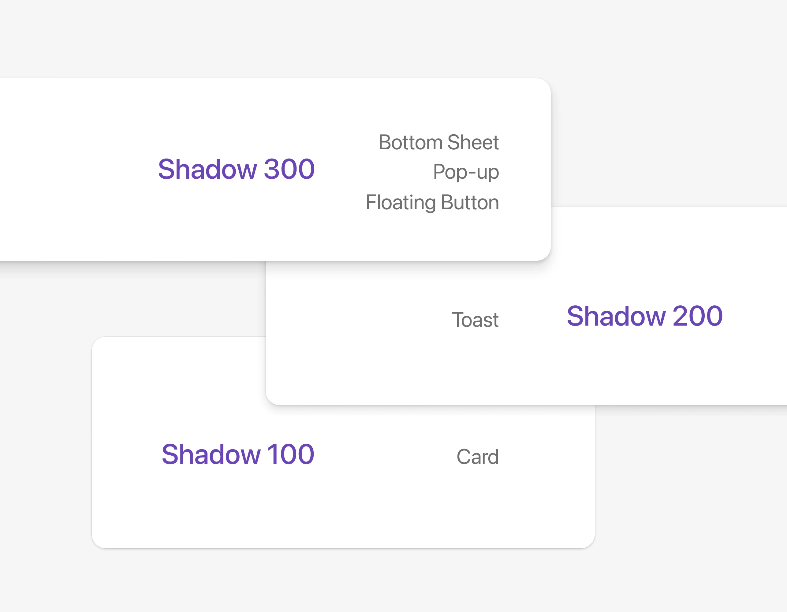
Materials

Materials

Elevation and shadow tiers for cards, sheets, toasts, and floating surfaces.
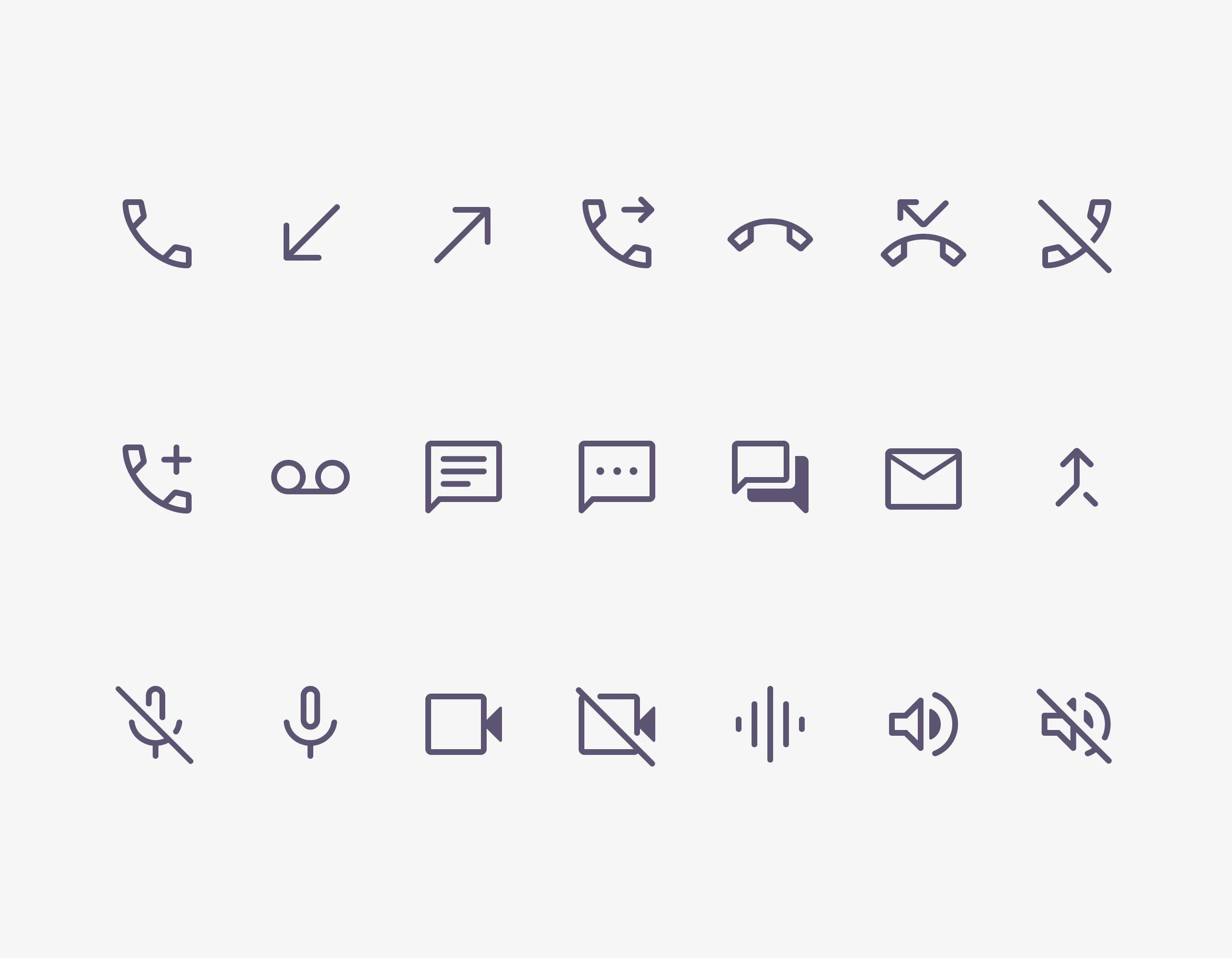
Icons

Icons

A unified icon set covering calling, messaging, and voice-detection states.
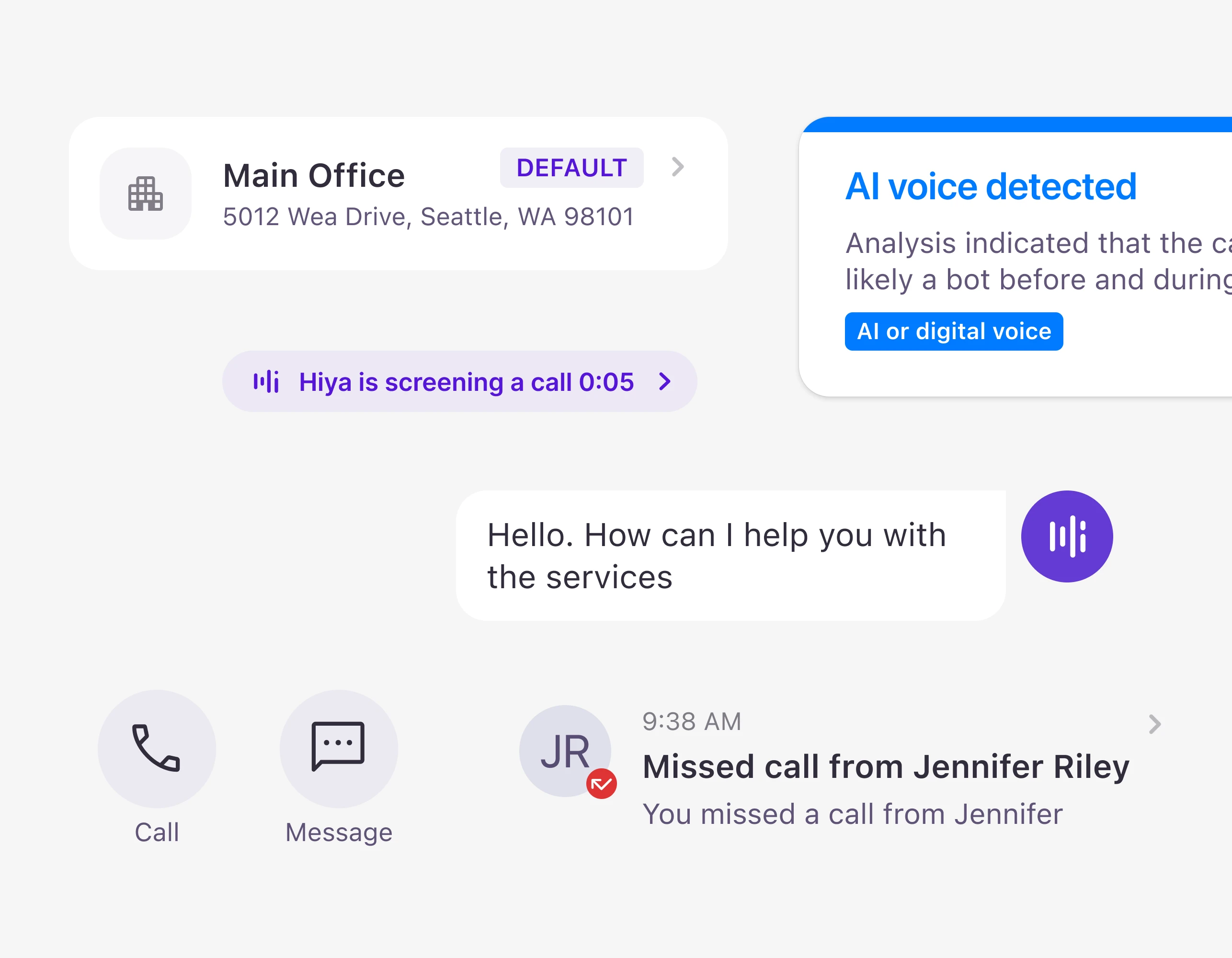
Components

Components

Shared building blocks powering both the Work Phone and Spam Blocker apps.
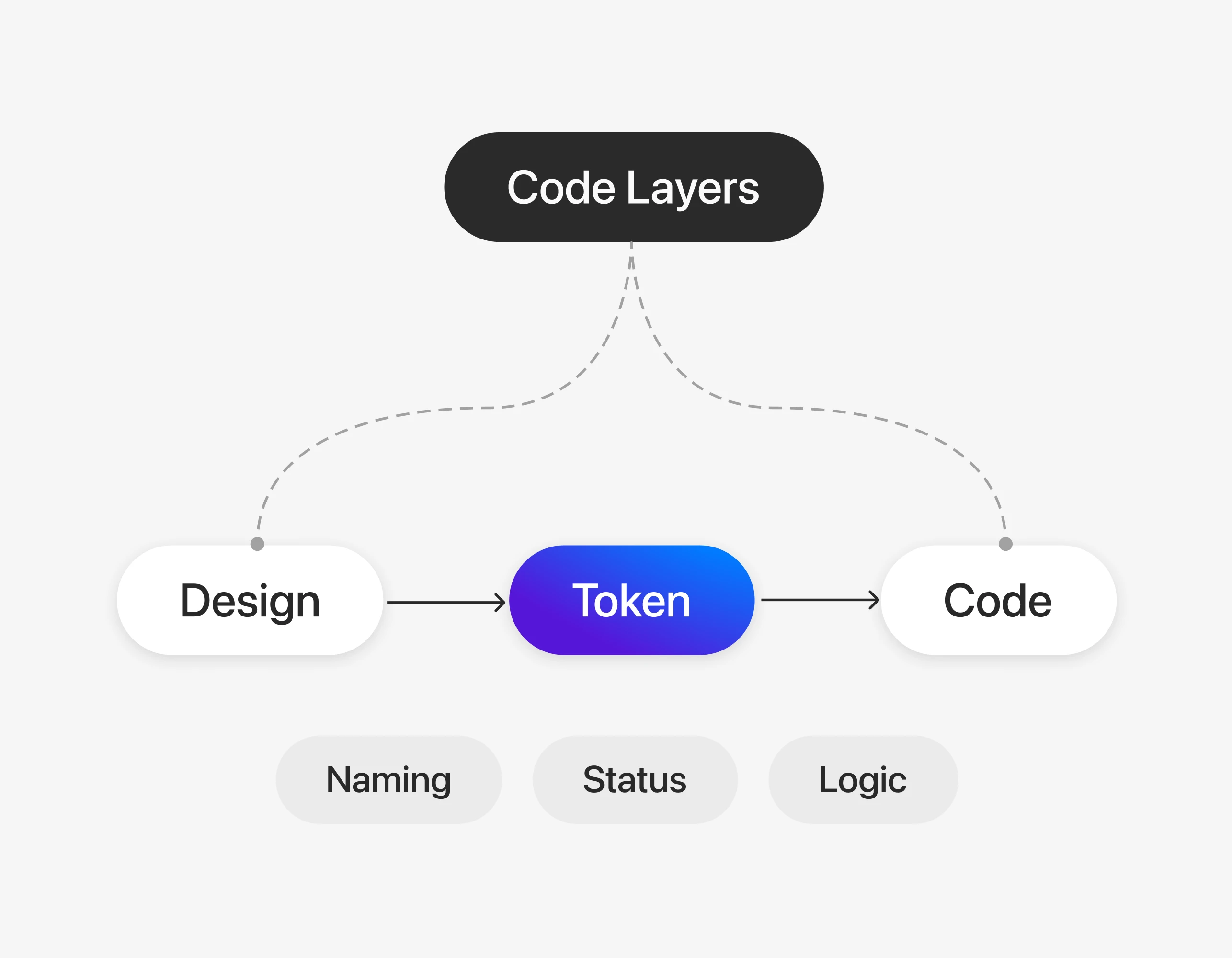
Code Layers

Code Layers

Design, token, and code share one naming and status contract.
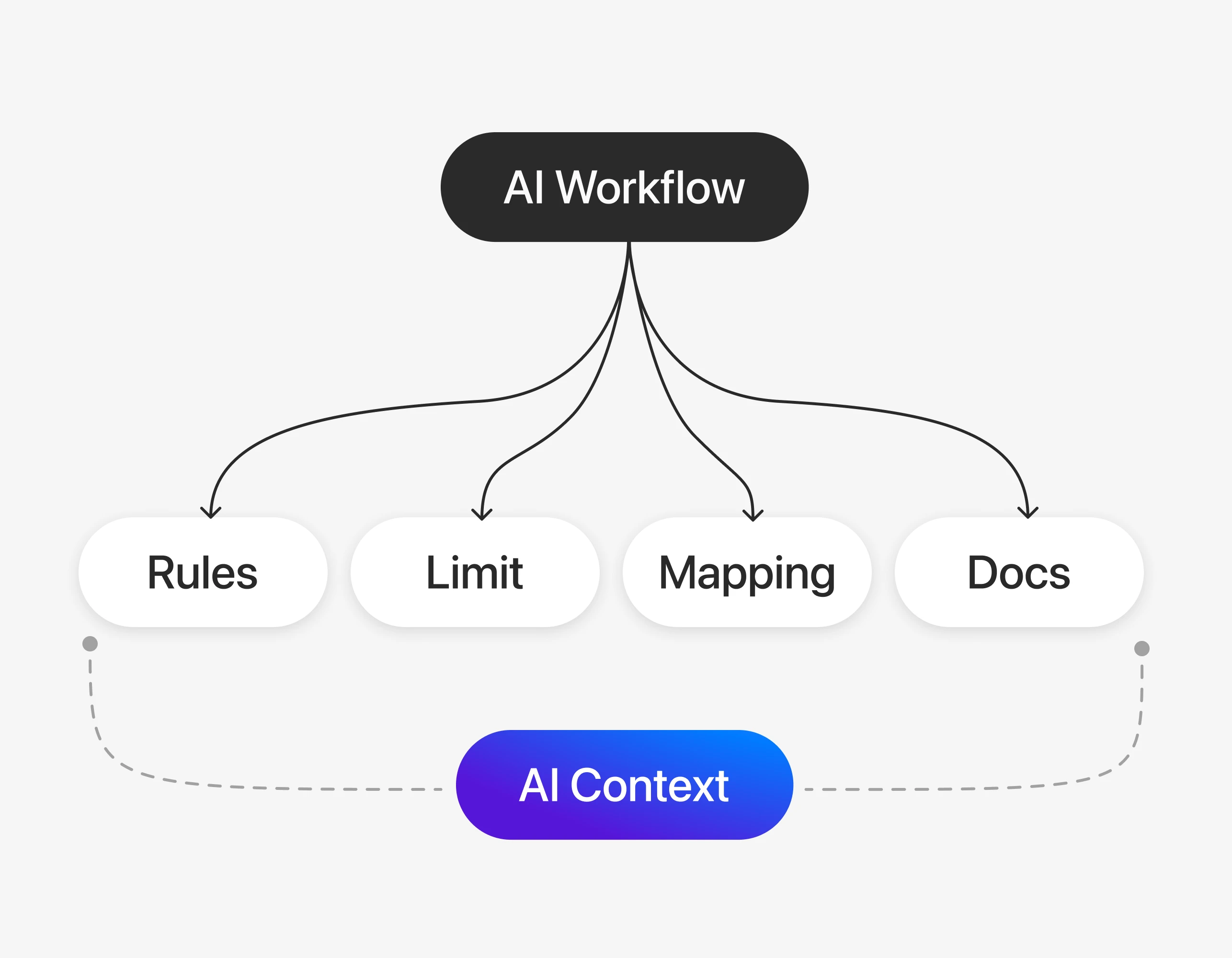
AI Context

AI Context

Rules, limits, and docs that an AI workflow reads as ground truth.

A rebuilt foundation: brand, color, type, materials, components, and the AI layer that reads and writes to all of it.


Deep dives

Why the Rebuild Mattered

This was more than a naming cleanup. Hiya’s design system needed to become a shared operating model for designers, engineers, and AI-assisted build workflows. As sole owner of the Figma library and both native codebases:

  • Theme updates like dark mode and contrast fixes required manual component audits instead of one token-level change.
  • Many components were designed for a single screen instead of built as reusable system primitives.
  • Android and iOS needed to feel consistent while still respecting each platform’s native patterns.
  • With no dedicated engineering support, maintaining components across two codebases was not sustainable.
  • The system served two product teams, Work Phone and Spam Blocker, with four codebases pulling from one source of truth.

Token Architecture as Product Strategy

The first upgrade was the token model. I replaced flat, value-based styles with three clear layers:

  • Primitive tokens store raw values like color, spacing, radius, type, and elevation.
  • Semantic tokens describe intent, such as surface, text, border, and interaction states.
  • Component tokens give engineers stable names to use directly in code.

That changed the system from a visual library into an implementation contract. Designers could still work in Figma, but the decisions were now structured enough for code, documentation, and AI-assisted workflows to read the same source of truth.
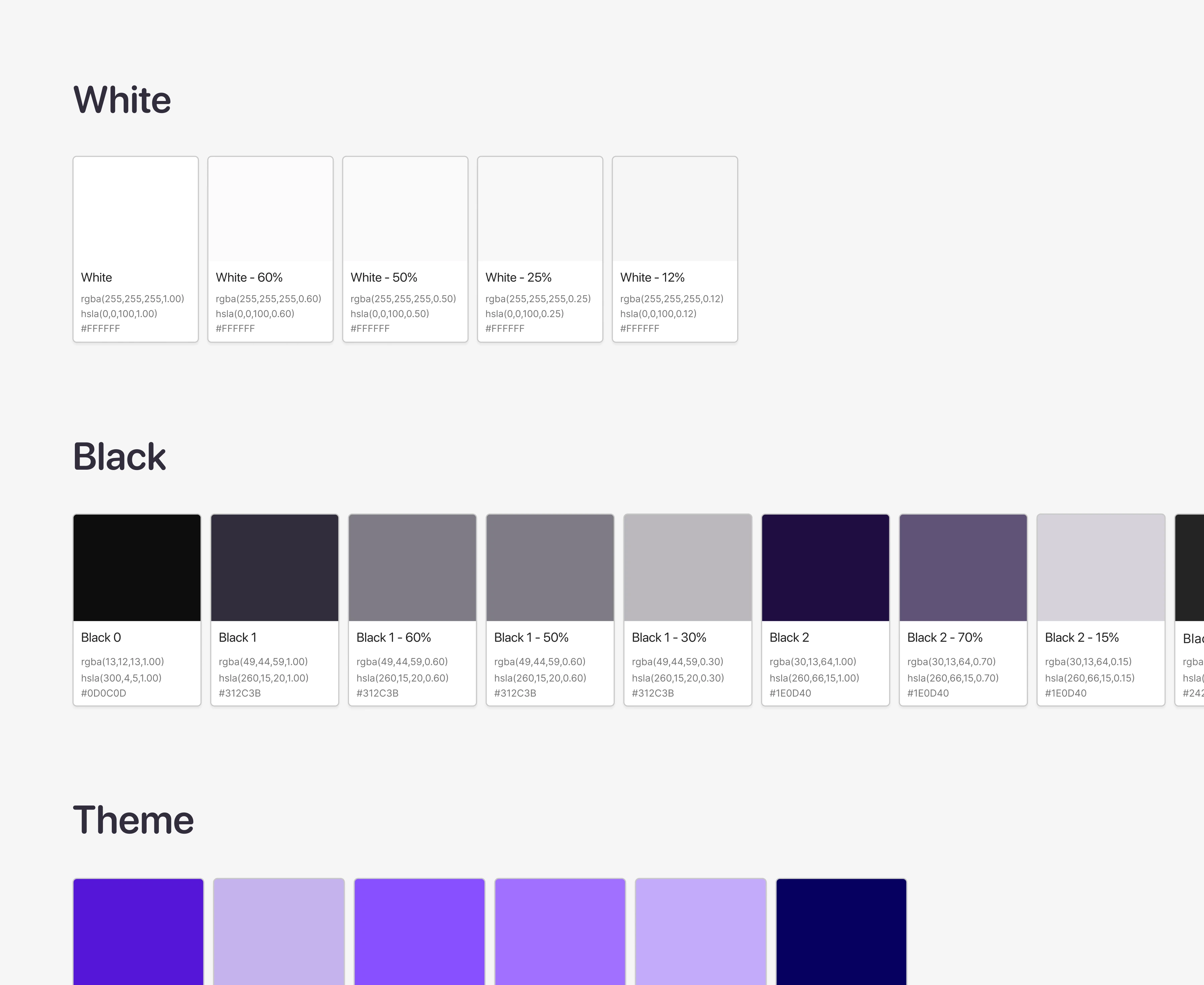
Literal token palettes grouped by color value

← Before

Semantic color tokens 65 mapped tokens
colors.bg Light #f6f5f7 Dark #0d0c0d
colors.bg.surface.brand.secondary Light #070060 Dark #211a80
colors.bg.surface Light #ffffff Dark #242425
colors.bg.surface.secondary Light #dfdfeb Dark #312c3b
colors.bg.surface.overlay Light #f6f5f7 Dark #373738
colors.bg.surface.nav Light #ffffff Dark #242425
colors.bg.backdrop Light rgba(49, 44, 59, 0.6) Dark rgba(49, 44, 59, 0.6)
colors.bg.surface.input Light rgba(223, 223, 235, 0.5) Dark rgba(255, 255, 255, 0.12)
colors.bg.surface.media Light #0d0c0d Dark #0d0c0d
colors.text.primary Light #312c3b Dark #ffffff
colors.text.secondary Light rgba(30, 13, 64, 0.7) Dark rgba(255, 255, 255, 0.6)
colors.text.tertiary Light rgba(49, 44, 59, 0.6) Dark rgba(255, 255, 255, 0.5)
colors.text.brand Light #5616d9 Dark #874fff
colors.text.on.surface Light #ffffff Dark #ffffff
colors.text.on.brand.accent Light #85d6ff Dark #85d6ff
colors.text.on.brand.subtle Light #dfdfeb Dark #dfdfeb
colors.text.interactive Light #5616d9 Dark #874fff
colors.text.critical Light #de3333 Dark #ff4545
colors.text.warning Light #cc831d Dark #cc831d
colors.text.information Light #007bff Dark #007bff
colors.text.success Light #398f4d Dark #63a653
colors.text.disabled Light rgba(49, 44, 59, 0.6) Dark rgba(255, 255, 255, 0.5)
colors.bg Light #f6f5f7 Dark #0d0c0d
colors.bg.surface.brand.secondary Light #070060 Dark #211a80
colors.bg.surface Light #ffffff Dark #242425
colors.bg.surface.secondary Light #dfdfeb Dark #312c3b
colors.bg.surface.overlay Light #f6f5f7 Dark #373738
colors.bg.surface.nav Light #ffffff Dark #242425
colors.bg.backdrop Light rgba(49, 44, 59, 0.6) Dark rgba(49, 44, 59, 0.6)
colors.bg.surface.input Light rgba(223, 223, 235, 0.5) Dark rgba(255, 255, 255, 0.12)
colors.bg.surface.media Light #0d0c0d Dark #0d0c0d
colors.text.primary Light #312c3b Dark #ffffff
colors.text.secondary Light rgba(30, 13, 64, 0.7) Dark rgba(255, 255, 255, 0.6)
colors.text.tertiary Light rgba(49, 44, 59, 0.6) Dark rgba(255, 255, 255, 0.5)
colors.text.brand Light #5616d9 Dark #874fff
colors.text.on.surface Light #ffffff Dark #ffffff
colors.text.on.brand.accent Light #85d6ff Dark #85d6ff
colors.text.on.brand.subtle Light #dfdfeb Dark #dfdfeb
colors.text.interactive Light #5616d9 Dark #874fff
colors.text.critical Light #de3333 Dark #ff4545
colors.text.warning Light #cc831d Dark #cc831d
colors.text.information Light #007bff Dark #007bff
colors.text.success Light #398f4d Dark #63a653
colors.text.disabled Light rgba(49, 44, 59, 0.6) Dark rgba(255, 255, 255, 0.5)
colors.text.inverse Light #ffffff Dark #312c3b
colors.icon.primary Light #312c3b Dark #ffffff
colors.icon.secondary Light rgba(49, 44, 59, 0.6) Dark rgba(255, 255, 255, 0.5)
colors.icon.tertiary Light rgba(49, 44, 59, 0.3) Dark rgba(223, 223, 235, 0.3)
colors.icon.disabled Light rgba(49, 44, 59, 0.3) Dark rgba(223, 223, 235, 0.3)
colors.icon.brand Light #5616d9 Dark #874fff
colors.icon.critical Light #de3333 Dark #ff4545
colors.icon.warning Light #cc831d Dark #cc831d
colors.icon.success Light #398f4d Dark #63a653
colors.icon.information Light #007bff Dark #007bff
colors.icon.inverse Light #ffffff Dark #312c3b
colors.icon.on.surface Light #ffffff Dark #ffffff
colors.icon.on.avatar.neutral Light #312c3b Dark #ffffff
colors.icon.neutral Light #312c3b Dark #312c3b
colors.border.primary Light rgba(223, 223, 235, 0.5) Dark #79747e
colors.border.secondary Light rgba(30, 13, 64, 0.15) Dark #dfdfeb
colors.border.interactive Light #874fff Dark #5616d9
colors.border.inverse Light #ffffff Dark #312c3b
colors.bg.fill.brand Light #5616d9 Dark #874fff
colors.bg.fill.brand.selected Light #5616d9 Dark #874fff
colors.bg.fill.brand.active Light #874fff Dark #5616d9
colors.bg.fill.brand.accent Light rgba(86, 22, 217, 0.3) Dark rgba(135, 79, 255, 0.45)
colors.text.inverse Light #ffffff Dark #312c3b
colors.icon.primary Light #312c3b Dark #ffffff
colors.icon.secondary Light rgba(49, 44, 59, 0.6) Dark rgba(255, 255, 255, 0.5)
colors.icon.tertiary Light rgba(49, 44, 59, 0.3) Dark rgba(223, 223, 235, 0.3)
colors.icon.disabled Light rgba(49, 44, 59, 0.3) Dark rgba(223, 223, 235, 0.3)
colors.icon.brand Light #5616d9 Dark #874fff
colors.icon.critical Light #de3333 Dark #ff4545
colors.icon.warning Light #cc831d Dark #cc831d
colors.icon.success Light #398f4d Dark #63a653
colors.icon.information Light #007bff Dark #007bff
colors.icon.inverse Light #ffffff Dark #312c3b
colors.icon.on.surface Light #ffffff Dark #ffffff
colors.icon.on.avatar.neutral Light #312c3b Dark #ffffff
colors.icon.neutral Light #312c3b Dark #312c3b
colors.border.primary Light rgba(223, 223, 235, 0.5) Dark #79747e
colors.border.secondary Light rgba(30, 13, 64, 0.15) Dark #dfdfeb
colors.border.interactive Light #874fff Dark #5616d9
colors.border.inverse Light #ffffff Dark #312c3b
colors.bg.fill.brand Light #5616d9 Dark #874fff
colors.bg.fill.brand.selected Light #5616d9 Dark #874fff
colors.bg.fill.brand.active Light #874fff Dark #5616d9
colors.bg.fill.brand.accent Light rgba(86, 22, 217, 0.3) Dark rgba(135, 79, 255, 0.45)
colors.bg.fill.brand.disabled Light rgba(86, 22, 217, 0.3) Dark rgba(135, 79, 255, 0.45)
colors.bg.fill.secondary Light #dfdfeb Dark rgba(255, 255, 255, 0.25)
colors.bg.fill.tertiary Light rgba(223, 223, 235, 0.5) Dark rgba(255, 255, 255, 0.12)
colors.bg.fill.disabled Light rgba(223, 223, 235, 0.5) Dark rgba(255, 255, 255, 0.12)
colors.bg.fill.inverse Light rgba(49, 44, 59, 0.6) Dark rgba(255, 255, 255, 0.6)
colors.bg.fill.critical Light #de3333 Dark #de3333
colors.bg.fill.critical.active Light #ff4545 Dark #de3333
colors.bg.fill.interactive Light #ffffff Dark rgba(255, 255, 255, 0.12)
colors.bg.fill.selected Light #070060 Dark #211a80
colors.bg.fill.success Light #398f4d Dark #63a653
colors.bg.fill.warning Light #cc831d Dark #cc831d
colors.bg.fill.information Light #007bff Dark #007bff
colors.bg.fill.neutral Light rgba(255, 255, 255, 0.6) Dark rgba(255, 255, 255, 0.6)
colors.bg.avatar.user Light #070060 Dark #211a80
colors.bg.avatar.company Light #1f8bff Dark #007bff
colors.bg.avatar.critcial Light #de3333 Dark #ff4545
colors.bg.avatar.contact Light #63a653 Dark #398f4d
colors.bg.avatar.neutral Light #dfdfeb Dark #312c3b
colors.bg.avatar.warning Light #cc831d Dark #cc831d
colors.bg.avatar.on.brand Light #dfdfeb Dark #dfdfeb
colors.bg.avatar.hiya.asssistant Light #653bd4 Dark #653bd4
colors.bg.fill.brand.disabled Light rgba(86, 22, 217, 0.3) Dark rgba(135, 79, 255, 0.45)
colors.bg.fill.secondary Light #dfdfeb Dark rgba(255, 255, 255, 0.25)
colors.bg.fill.tertiary Light rgba(223, 223, 235, 0.5) Dark rgba(255, 255, 255, 0.12)
colors.bg.fill.disabled Light rgba(223, 223, 235, 0.5) Dark rgba(255, 255, 255, 0.12)
colors.bg.fill.inverse Light rgba(49, 44, 59, 0.6) Dark rgba(255, 255, 255, 0.6)
colors.bg.fill.critical Light #de3333 Dark #de3333
colors.bg.fill.critical.active Light #ff4545 Dark #de3333
colors.bg.fill.interactive Light #ffffff Dark rgba(255, 255, 255, 0.12)
colors.bg.fill.selected Light #070060 Dark #211a80
colors.bg.fill.success Light #398f4d Dark #63a653
colors.bg.fill.warning Light #cc831d Dark #cc831d
colors.bg.fill.information Light #007bff Dark #007bff
colors.bg.fill.neutral Light rgba(255, 255, 255, 0.6) Dark rgba(255, 255, 255, 0.6)
colors.bg.avatar.user Light #070060 Dark #211a80
colors.bg.avatar.company Light #1f8bff Dark #007bff
colors.bg.avatar.critcial Light #de3333 Dark #ff4545
colors.bg.avatar.contact Light #63a653 Dark #398f4d
colors.bg.avatar.neutral Light #dfdfeb Dark #312c3b
colors.bg.avatar.warning Light #cc831d Dark #cc831d
colors.bg.avatar.on.brand Light #dfdfeb Dark #dfdfeb
colors.bg.avatar.hiya.asssistant Light #653bd4 Dark #653bd4

After →

One token, two values. Each semantic token owns both its light and dark value, so engineers do not have to write conditional theme logic. When a dark-mode value failed in context, the fix was to correct the token globally or add a new semantic token with the right purpose.

Built to extend, not prescribe. Components use Figma variants and slots so they can flex across contexts instead of being rebuilt for each screen.
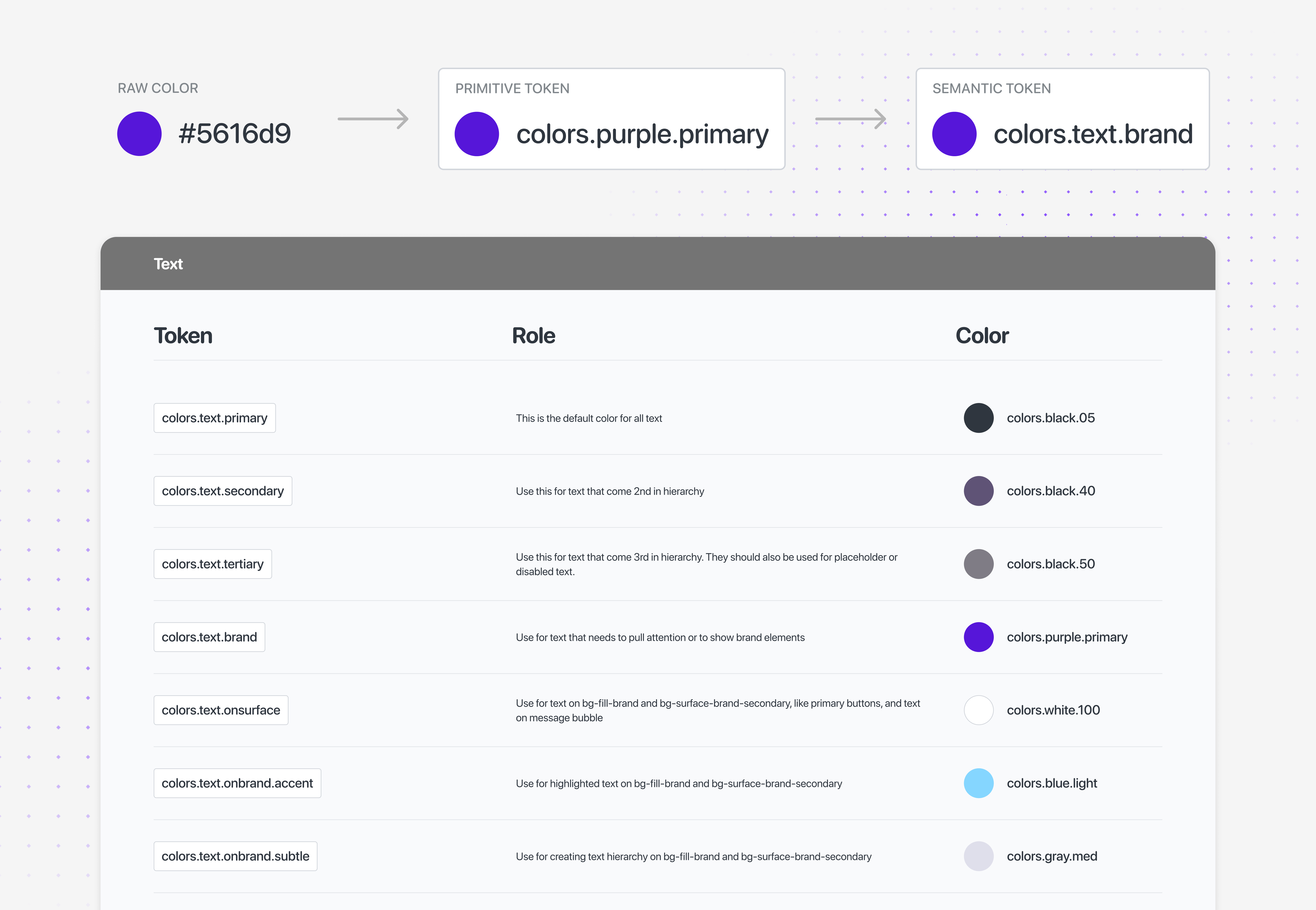
Token architecture: a raw color value resolves to a primitive token, then a semantic token, shown alongside the resulting text color token table

Structure for an AI-Native System

The second upgrade was making the system legible outside the design file. Tokens, components, usage rules, and generated code needed to live in a structure an engineer or AI agent could navigate without guessing.

I organized the package around predictable layers: token definitions, primitive building blocks, component APIs, examples, and platform-specific implementation notes. That structure lets an agent answer practical questions before generating code: which token should be used, which component already exists, what variants are allowed, and where platform behavior needs to diverge.

The goal was not to let AI invent UI faster. It was to make the design system strict enough that AI-assisted work stays inside the same decisions a designer or engineer would use.
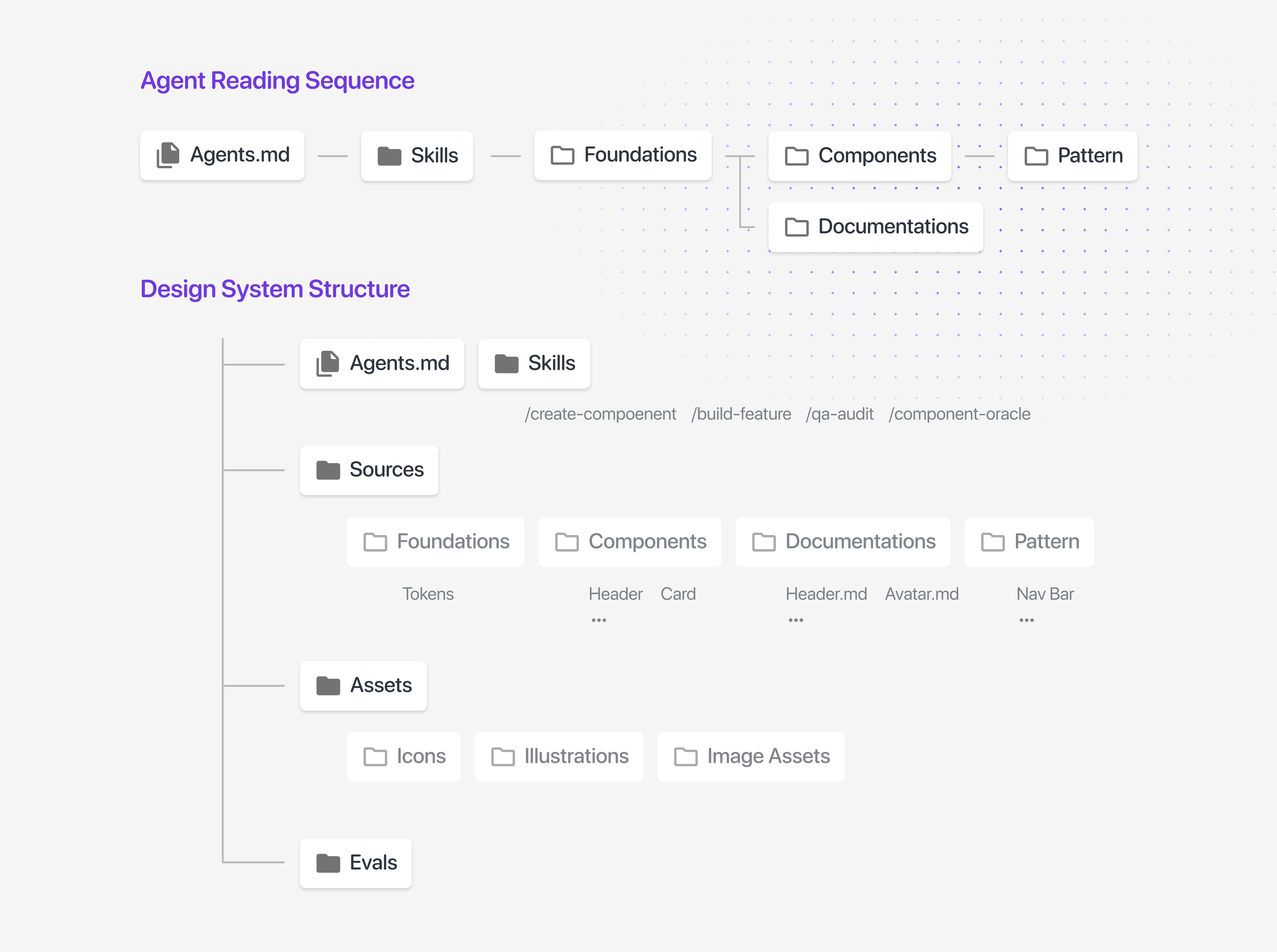
The design system package structure

An AI-Augmented Build Pipeline

Owning the design system alone meant I needed a build process that could scale with the library. Manual component authoring across Android and iOS was too slow, and one-off AI output was too risky without clear system rules.

→ Decision

Built custom /create-component and /build-feature skills around the design system's own files. Components.csv and Token.json became the source of truth for names, variants, and approved styling decisions.

Used the same workflow for Android and iOS, with separate generation paths for Kotlin, Jetpack Compose, and Swift. Shared definitions kept the design language aligned while platform-specific code stayed native.

I treated generation like migration work, not a magic button. Tokens came first, then primitive building blocks, then the remaining components in small, reviewable batches. Smaller passes made the output easier to validate and kept mistakes from spreading through the system.
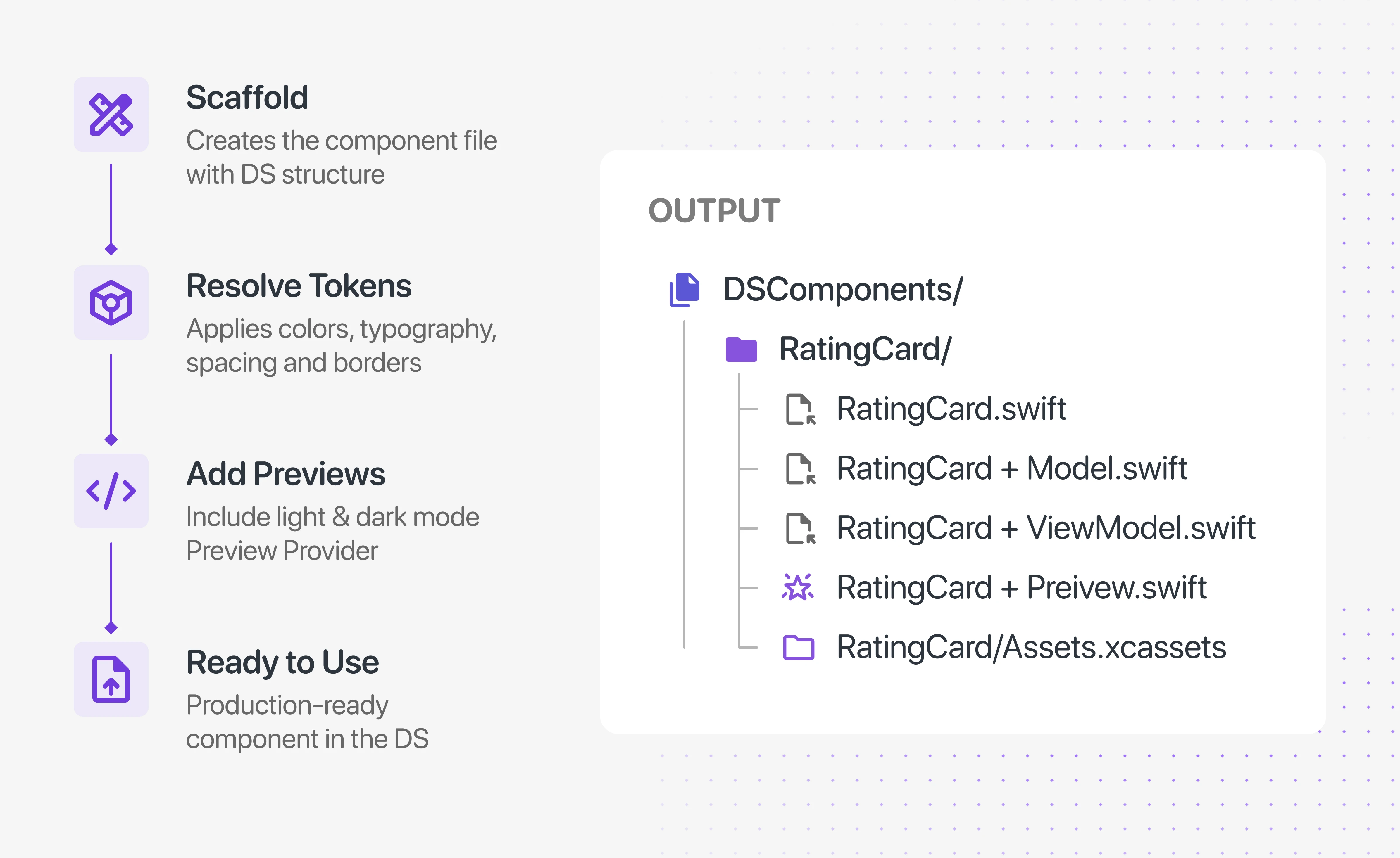
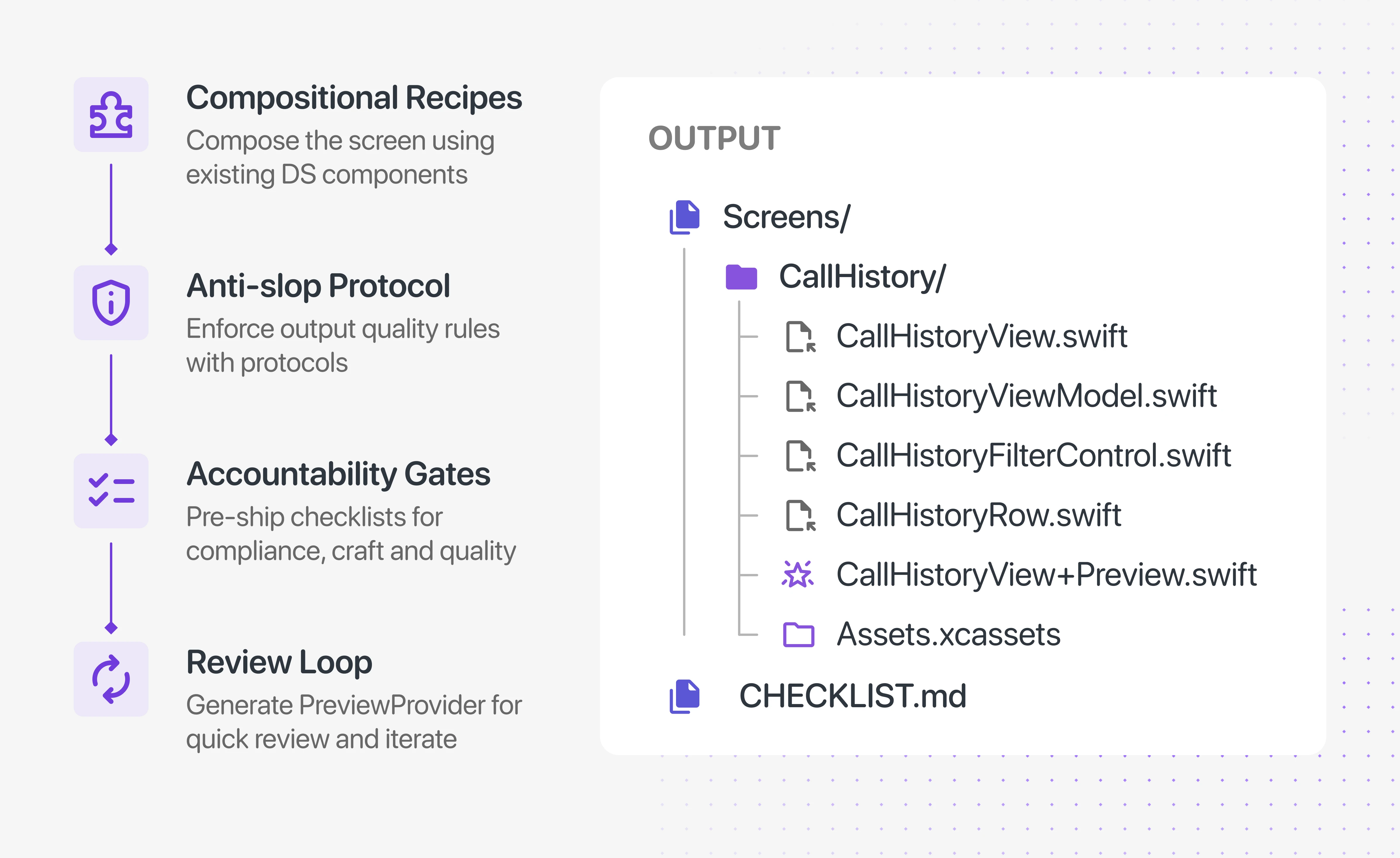
$ /create-component RatingCard
/create-component skill process (scaffold → resolve tokens → add previews → ready to use) and its generated output file tree
$ /build-feature CallHistory
/build-feature skill process (compositional recipes → anti-slop protocol → accountability gates → review loop) and its generated CallHistory screen output

The skills help with authoring new components. The larger goal is different: make the finished system readable enough that an agent can use the existing library, follow its constraints, and produce UI that still feels like Hiya.
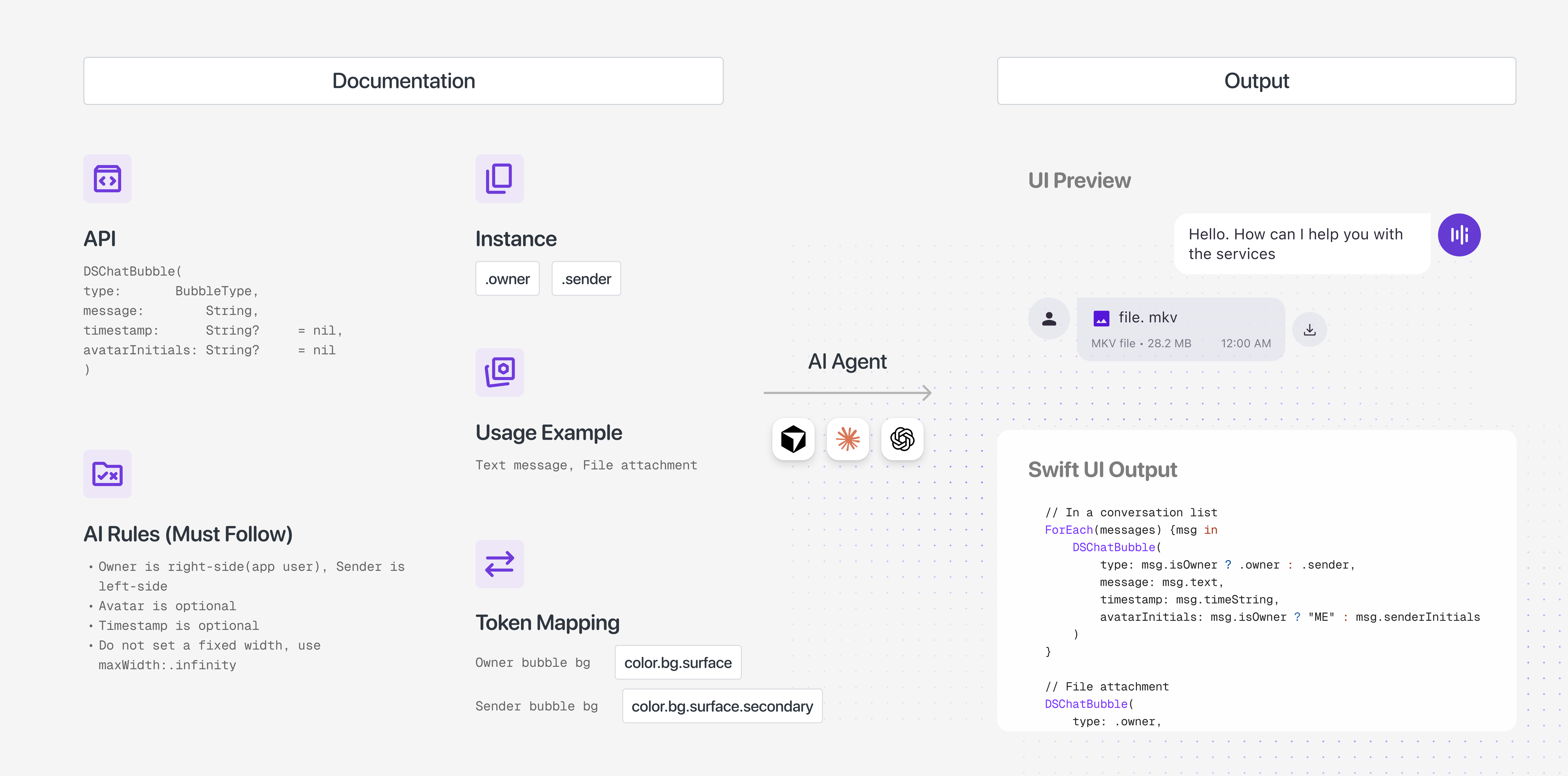
Component documentation (API, instance variants, usage examples, AI rules, and token mapping) feeding an AI agent, which outputs a working SwiftUI implementation using the documented DS components

Cross-Platform Consistency (Android + iOS)

Android and iOS should feel like the same product, but they should not pretend to be the same platform. The design system needed one shared language for intent, with enough flexibility for each implementation to stay native.

→ Decision

Kept Figma as the shared source of truth and marked Android-specific variants directly in the library. Platform differences stayed visible without splitting the design language into separate systems.

Process

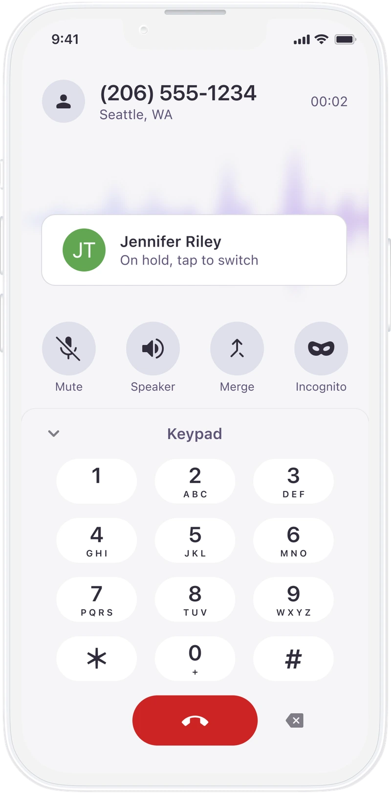
Figma is the system of record. Updates start there, then move into platform implementation, PR review, and release. Android and iOS can ship on different version numbers because their release paths are different, but the design contract stays aligned.

The v1.2.0 migration to Material Symbols is a good example. It simplified the iOS icon set and moved both platforms toward the same icon language, reducing the amount of manual alignment work between teams.

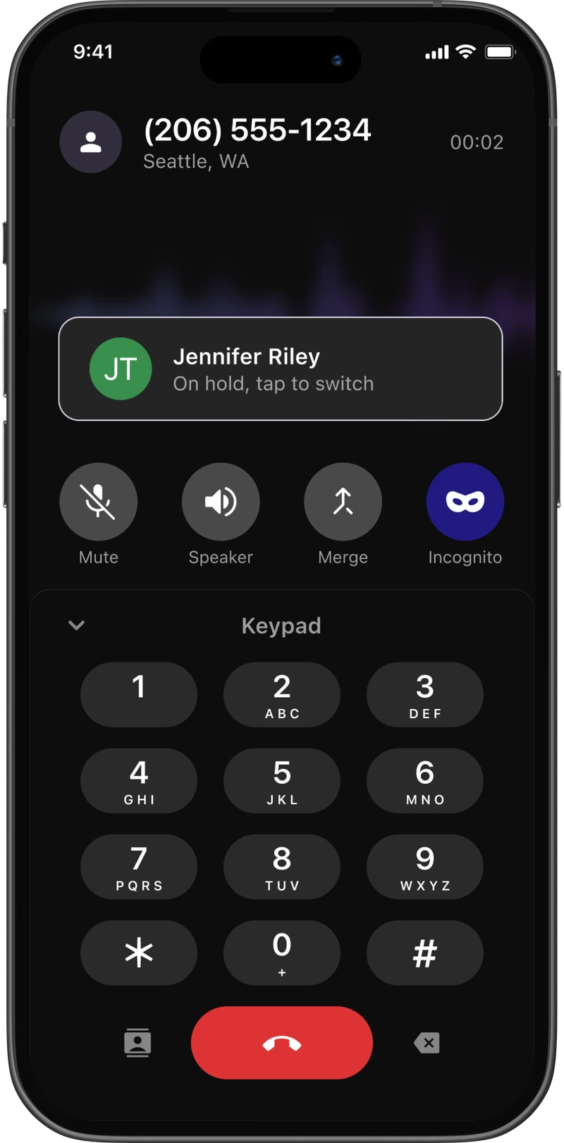
Light
Light

Dark

Dark

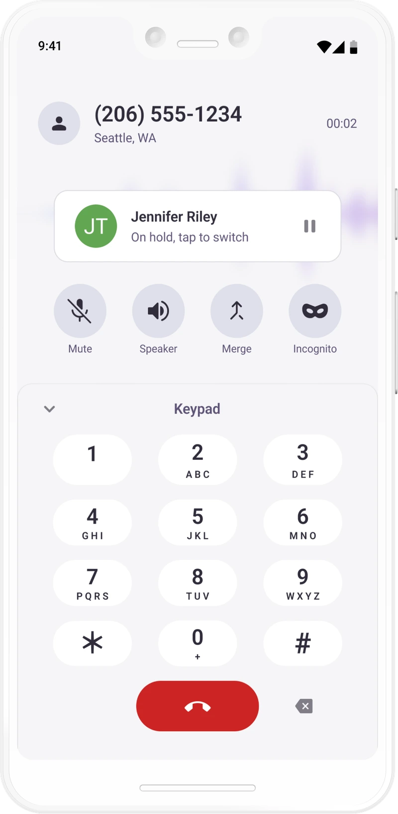
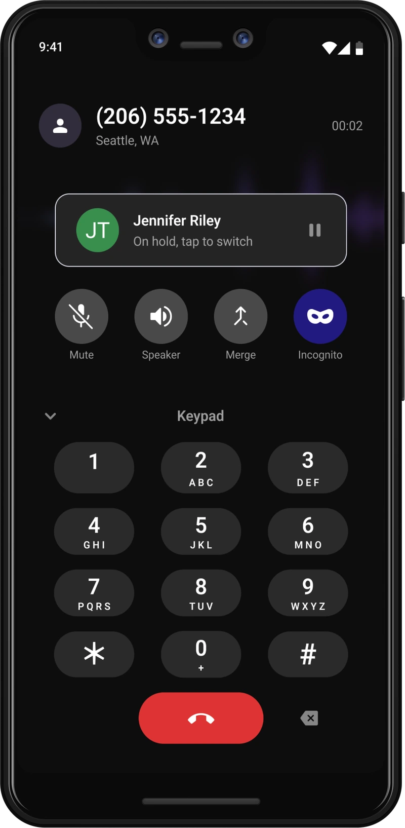
Light

Light

Dark

Dark

Migration Process: Legacy to Semantic Tokens

The migration had two very different starting points. Spam Blocker could start fresh on the new semantic system. Work Phone already had years of legacy styling, so the work had to be staged, measurable, and safe to repeat.

The first track was token adoption:

  1. Integrate the new DS package and replace the legacy HiyaColor alias table as the styling source.
  2. Run ds-token-guard.sh to establish a baseline of remaining legacy values.
  3. Rebuild one flow at a time so each change could be reviewed in context.
  4. Run the guard again after each flow or batch to confirm progress and prevent regressions.

01

Integrate the package

Replaces the legacy design system as the design source

02

Run baseline check

Runs ds-token-guard.sh for any remaining legacy values

03

Rebuild flow by flow

Rebuilds screens using new design system components flow by flow

04

Re-run the guard

Confirms cleanup and catches regressions before merge

This made the app speak the design system’s token language, but it did not mean the app had fully adopted the component library. A codebase check found only one DS package component in use: DSKeypad, across 3 sites. Everything else still lived as local components such as PrimaryButton, InfoCard, MetricTile, and ToastView.

That distinction matters. Token migration is fast and largely automatable. Hundreds of styling swaps can happen through scripts and targeted review. Component adoption is slower because each local component has product behavior, edge cases, and screen-level dependencies.

I kept those tracks separate on purpose. Token adoption improves visual consistency now and gives the guard something concrete to enforce. Component adoption can then happen screen by screen, starting with a gap audit that maps each local component to a DS equivalent or identifies what the system still needs.

The changelog shows how the migration moved from tokens to icons to drift cleanup:

Changelog
v1.1.0

Accessibility-driven token migration

Changed
14 light-mode and 6 dark-mode semantic color tokens remapped to meet WCAG AA contrast, each with documented before and after values such as textCritical: #DE3333#CC2424.
v1.2.0

Icon system migration to Material Symbols

Changed
Replaced the legacy custom icon set with Material Symbols for cross-platform consistency.
Removed
43 legacy icons retired with an explicit old-to-new mapping table. Custom call-state icons such as incoming, missed, and blocked were preserved.
v1.5.0

Full icon system regeneration

Added
417 new DS.Icons cases regenerated from the asset catalog, closing a drift gap between code references and real icon assets.
Fixed
Two live bugs surfaced through the drift audit: blank icons in an avatar Blocked state and a keypad speakerphone toggle.
Removed / Renamed
41 cases renamed for Material Symbols alignment, with 9 unused cases removed.

Legacy names were retired with explicit replacement mappings in the changelog, so engineers had a clear path through each breaking change.

Legacy Tokens Remaining

Flagged legacy tokens across token checks 70% resolved

558 179 121 0

Adherence & Governance

A token migration only works if the system can keep itself clean after the first pass. I added guardrails that made legacy styling visible, reviewable, and harder to reintroduce.

A CI-gating shell script (ds-token-guard.sh) scans for four regression vectors: retired HiyaColor aliases, system fonts that bypass DS.Typography, undocumented HiyaPalette anchors, and raw Color(hex:) calls outside the palette file. The check is deterministic static analysis, which is the right tool for enforcement. AI helps with authoring and migration; the guard keeps the rules from drifting.
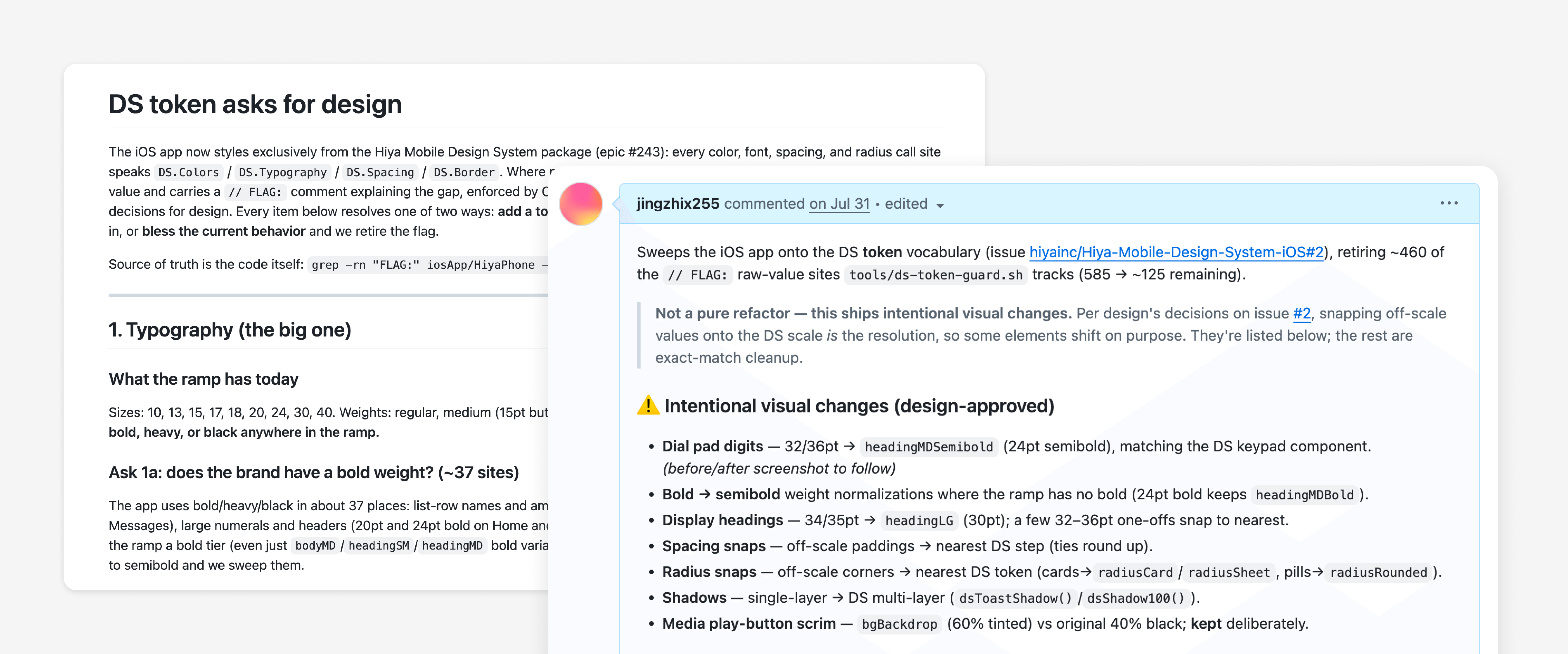
The docs/ds-token-asks-for-design.md decision ledger — each flagged site resolved as either a real gap (add a token upstream) or a blessed exception — alongside a real PR comment sweeping the Typography category

Every flagged site carries a // FLAG: comment and is logged to a running decision document (docs/ds-token-asks-for-design.md). Each item resolves as either a new upstream token or a documented exception. That gave engineering a normal PR workflow while keeping each design decision owned and traceable.


Collaboration & Alignment

As the sole design system owner, I owned the architecture, token model, and migration rules directly. Component and visual decisions were shaped with design peers, then moved through the same PR review process as product code. Because the org was already moving toward AI-native workflows, a codified and versioned DS repo gave design and engineering a shared place to align.
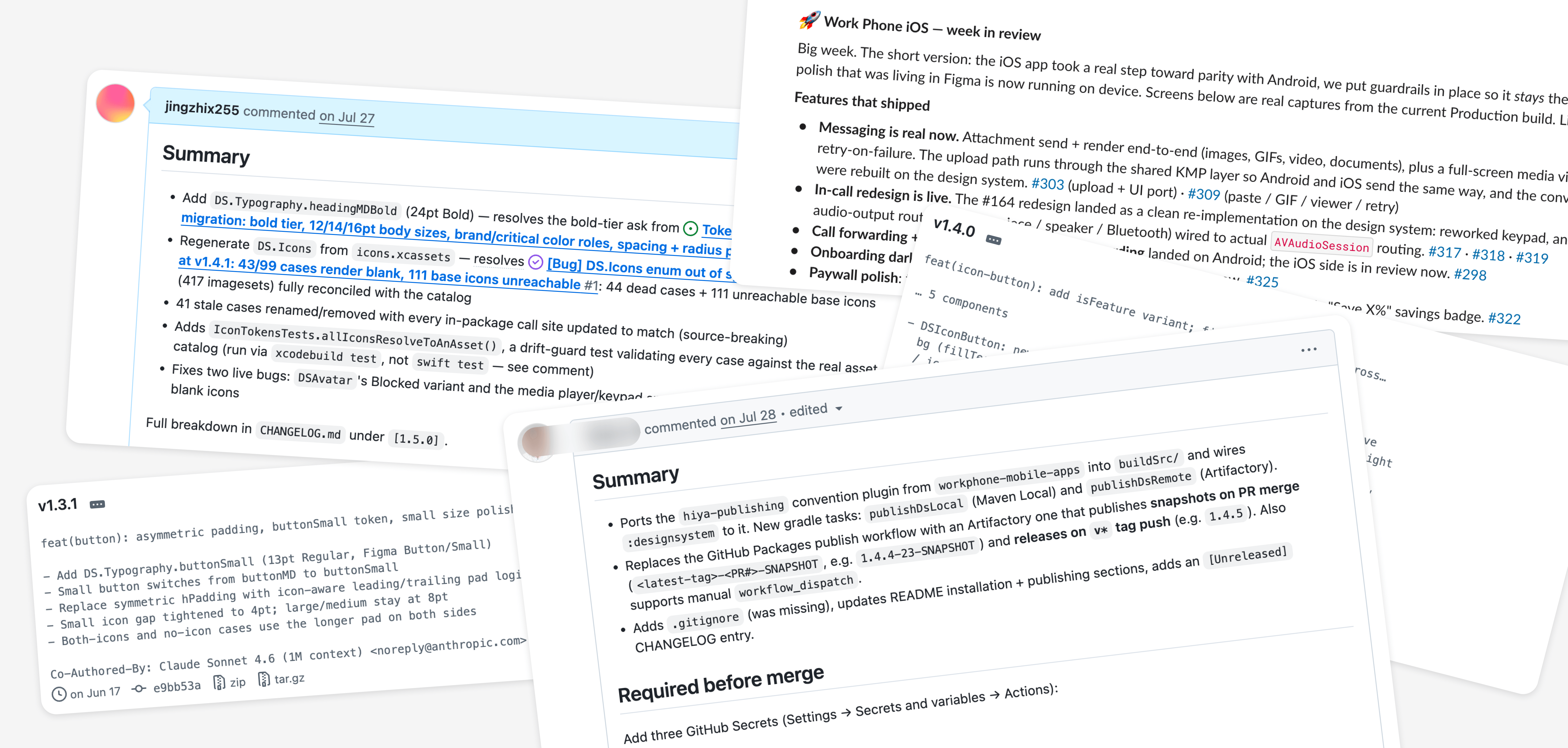
Collaboration and alignment across design and engineering

Impact

0 → 1

AI-native design system foundation

A token model, component docs, and build workflow from scratch

4

Native codebases aligned

Work Phone and Spam Blocker across Android and iOS

70%

Legacy styling debt resolved

Measured with token guardrails instead of manual audits

Reflection

Own the system, not just the screen

Owning both the design and code side of this migration taught me that designing for scale is a different discipline than designing a single screen — every decision has to hold up across platforms, teams, and components I'll never personally touch again. The token architecture and the enforcement guard matter more than any one screen, because they keep future decisions consistent without me in the room.

← Back to all work View live project ↗