Deep dives
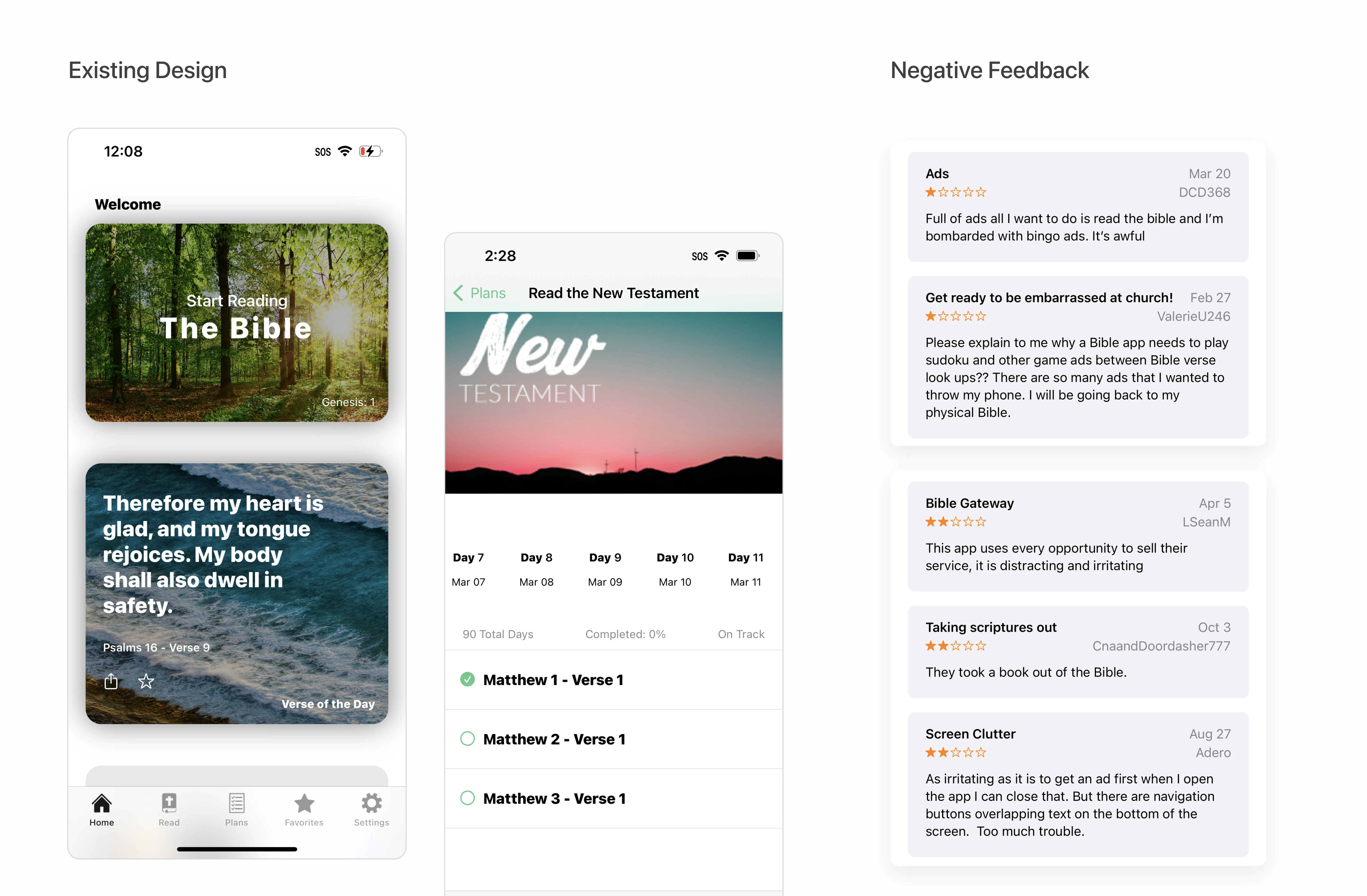
The Problem
The goal was to overhaul the app to boost retention and reading engagement, but we faced significant structural and resourcing roadblocks:
- Scope vs. Resources: The app’s feature set was vast, and it was overwhelming to know where to begin . With limited resources, we couldn’t redesign everything at once; I had to pinpoint exactly which areas would actually move the needle on retention.
- Broken Workflows: The existing engineering process excluded design from key decision-making and lacked pre-release QA, resulting in poor implementation quality.
- Usability Debt: Core features like “Compare Verses” were functionally broken, with only 20% of users engaging with them due to confusing, non-standard navigation.
Instead of guessing, I used analytics to narrow our scope down to two primary MVP focus areas: fixing the core reading experience and completely overhauling the “Plan” tab. Simultaneously, I re-engineered our cross-functional delivery process to ensure design quality.
In addition, to solve a massive content bottleneck I found during investigation within the Plan tab, I designed an AI-Automated Custom Plan Generator guided by Google’s People+AI framework.
Fixing Core Usability - The Reading Experience
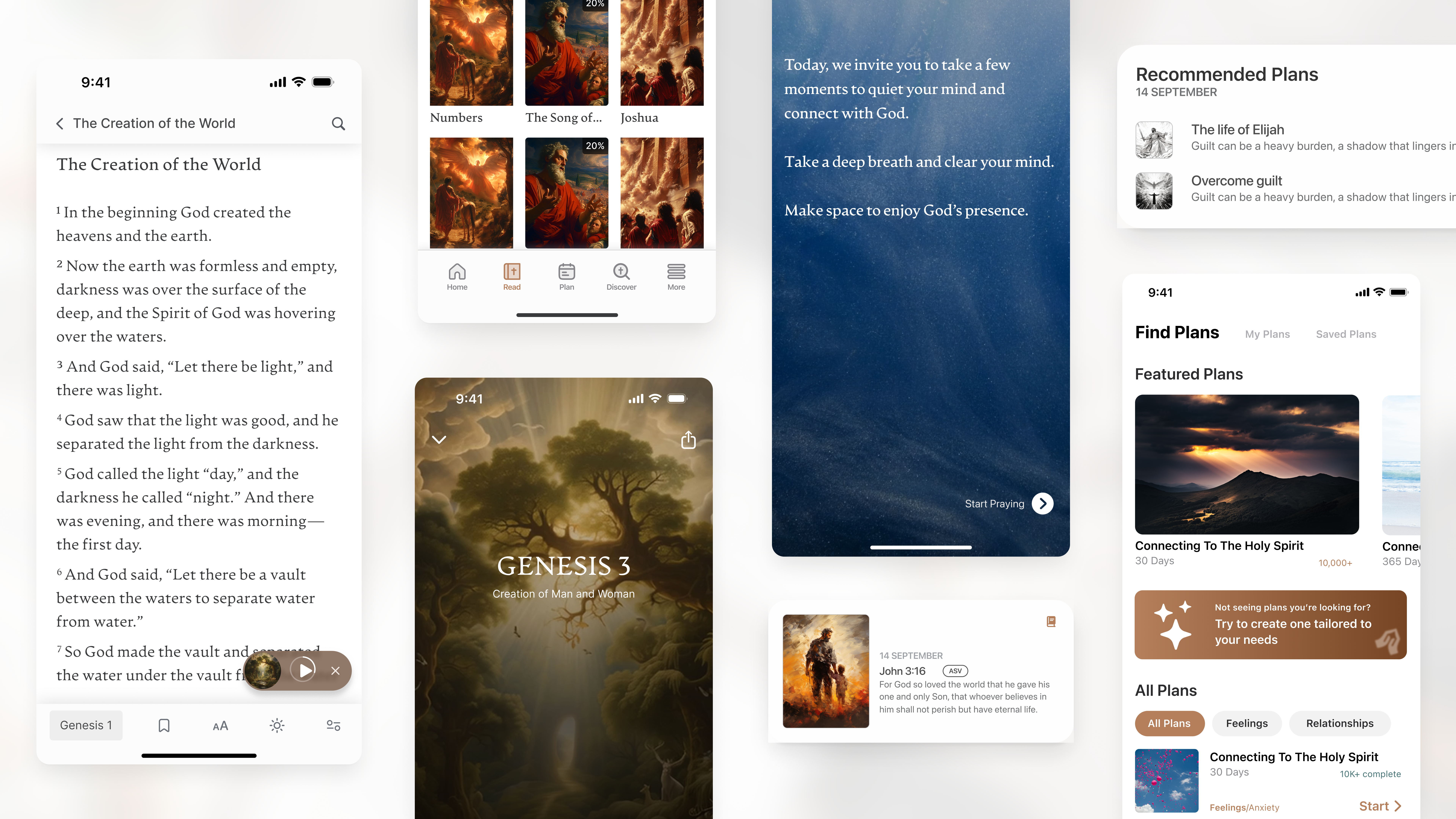
When I first started, the scope of the redesign felt overwhelming . To find the highest-impact areas for retention, I mapped out the entire app architecture and dug into our analytics.
Opportunity (Core Reading Experience)
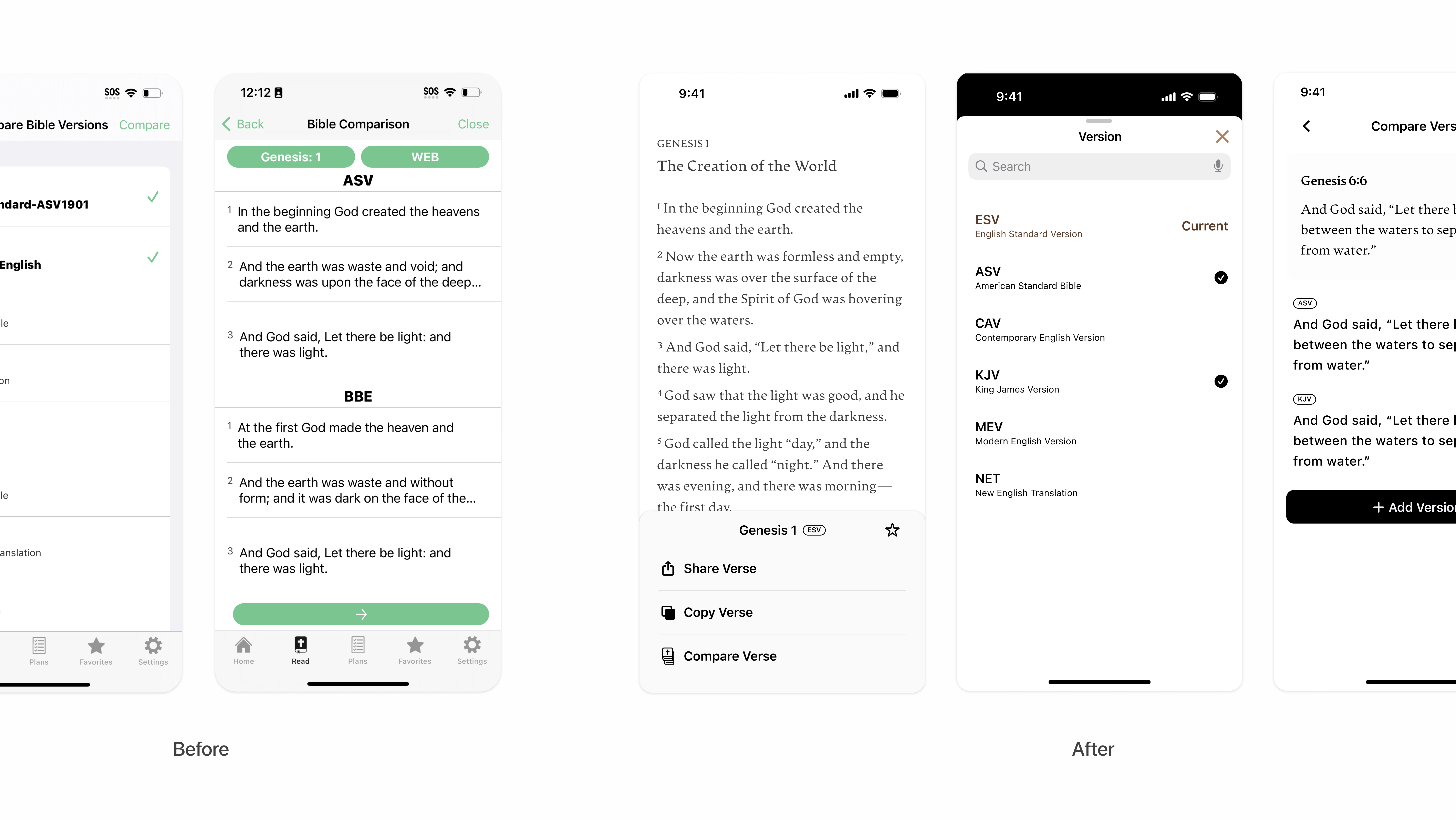
For Bible readers, comparing different translations is an essential, highly valued feature. However, our data tracking showed the “Compare Verse” tool was severely underutilized, seeing only 20% engagement. A subsequent cognitive walkthrough uncovered the root cause: the interface displayed entire chapters at once rather than isolating specific verses, completely failing to match the user’s mental model for comparison .
The Fix
I restructured the information architecture. The new design focuses on a single selected verse, clearly labels the current version at the top, and allows users to toggle multiple translation versions simultaneously for direct, side-by-side comparison .
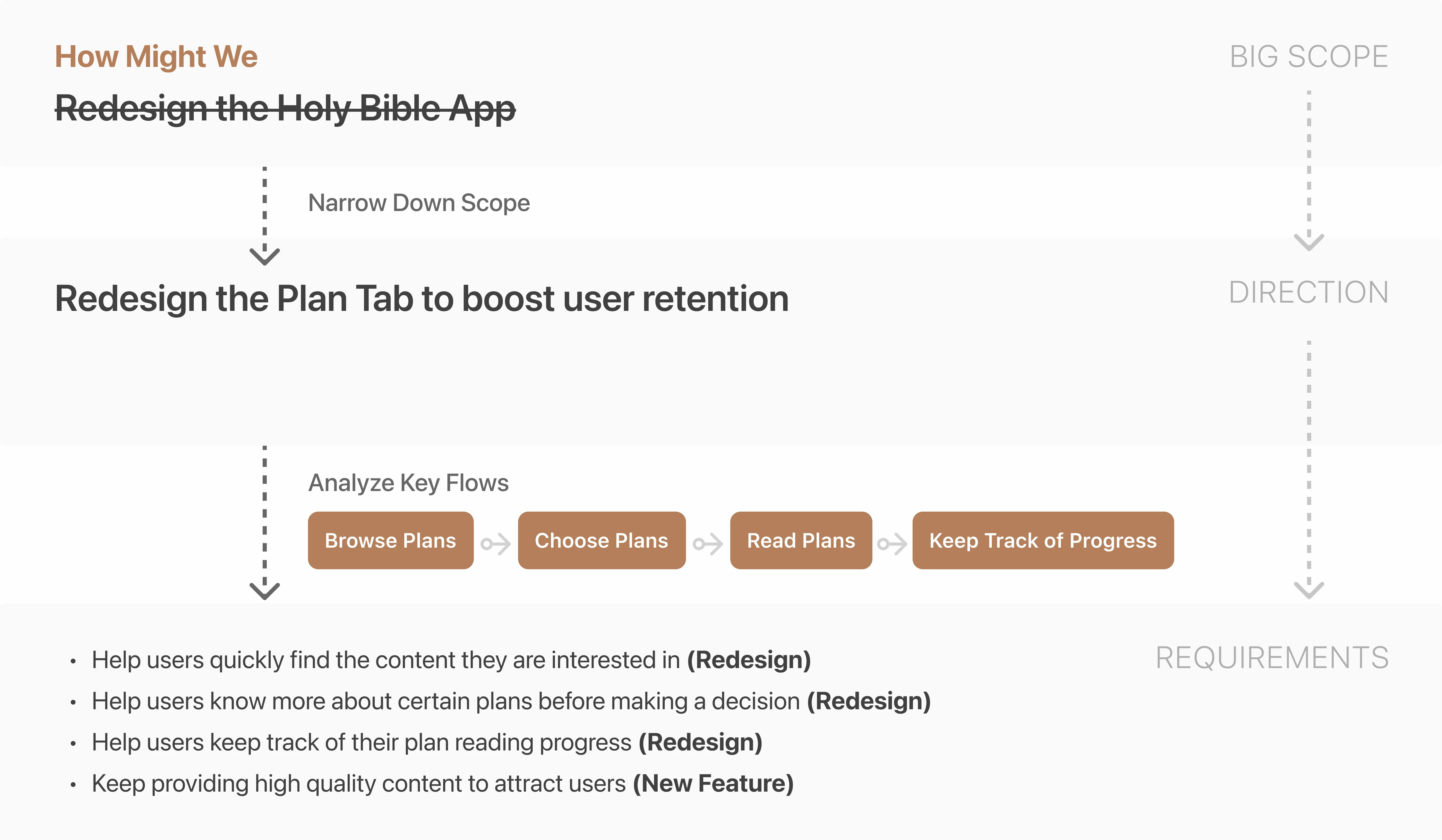
Using Data-Driven Prioritization to Narrow the Scope
The previous data analysis also revealed a hidden opportunity: 45.2% of users interacted with the “Plan” Tab, making it the second most popular area for engagement . However, 19.4% of users abandoned the flow immediately after viewing a plan summary, indicating severe friction .
Making the Plan Tab our primary target for the MVP to boost retention.
The Bottleneck (Content Generation)
Focusing on the Plan Tab uncovered a structural business issue: we only had 1 content writer for all mobile products . It was impossible to manually scale high-quality, diverse reading plans to keep users retained.
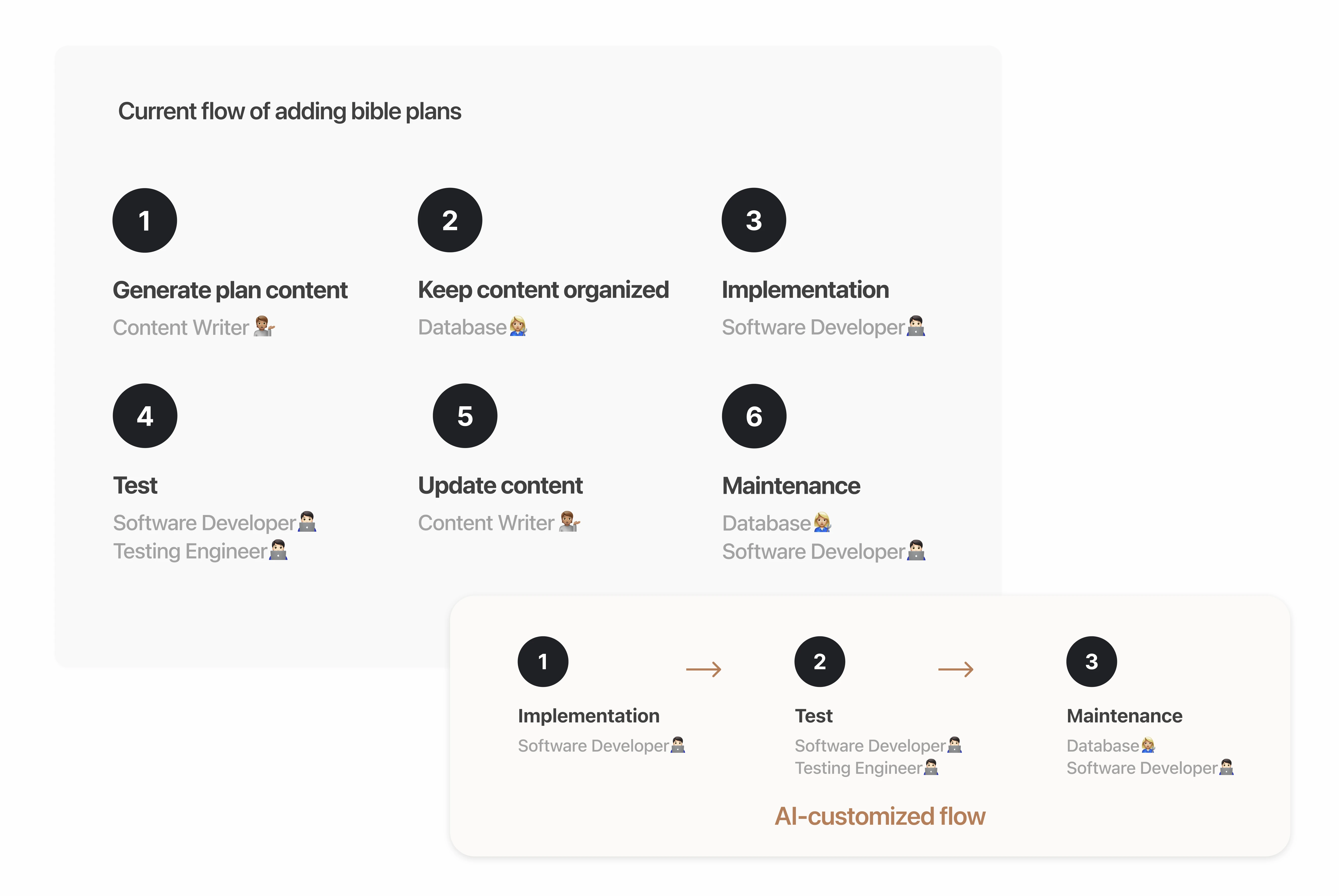
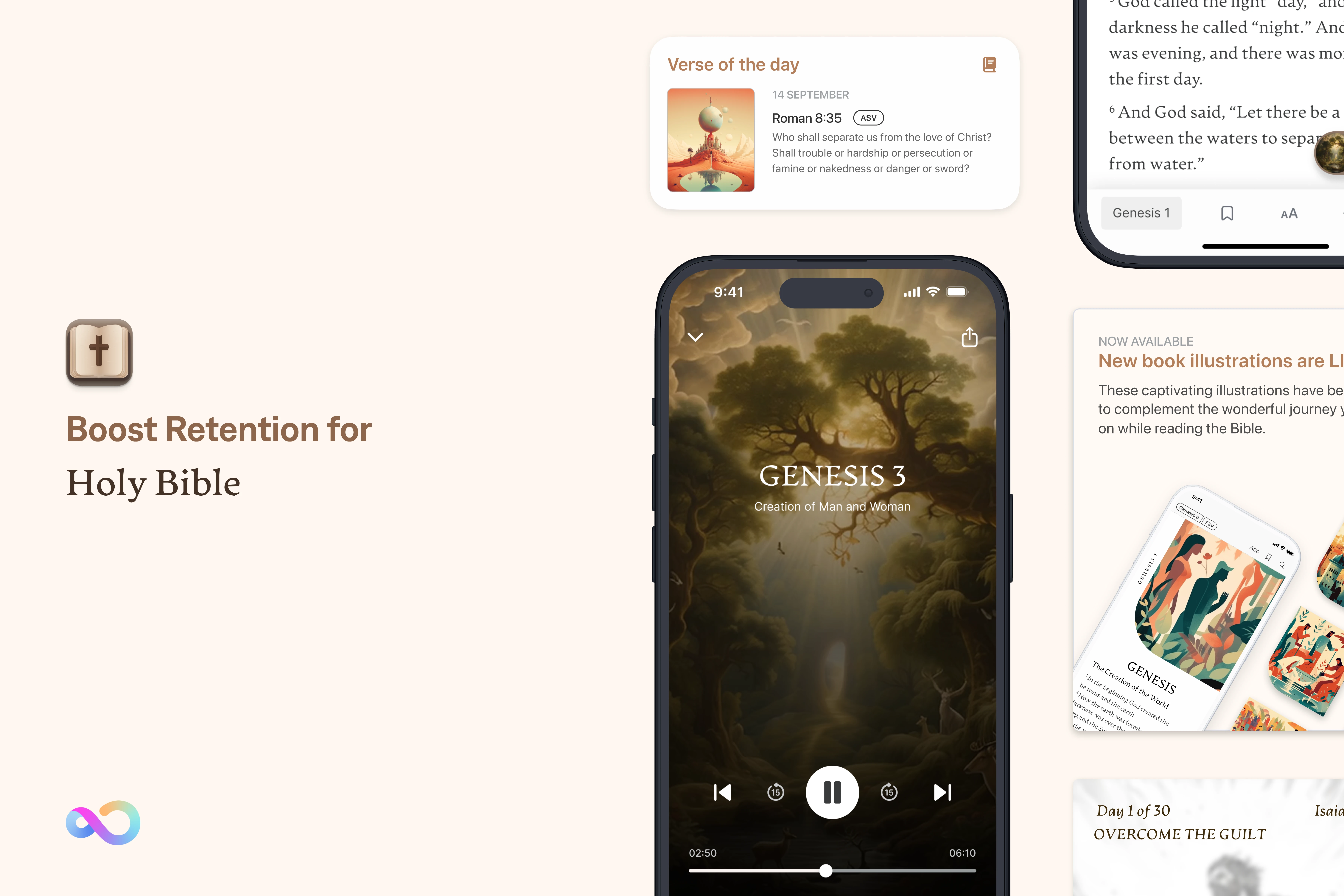
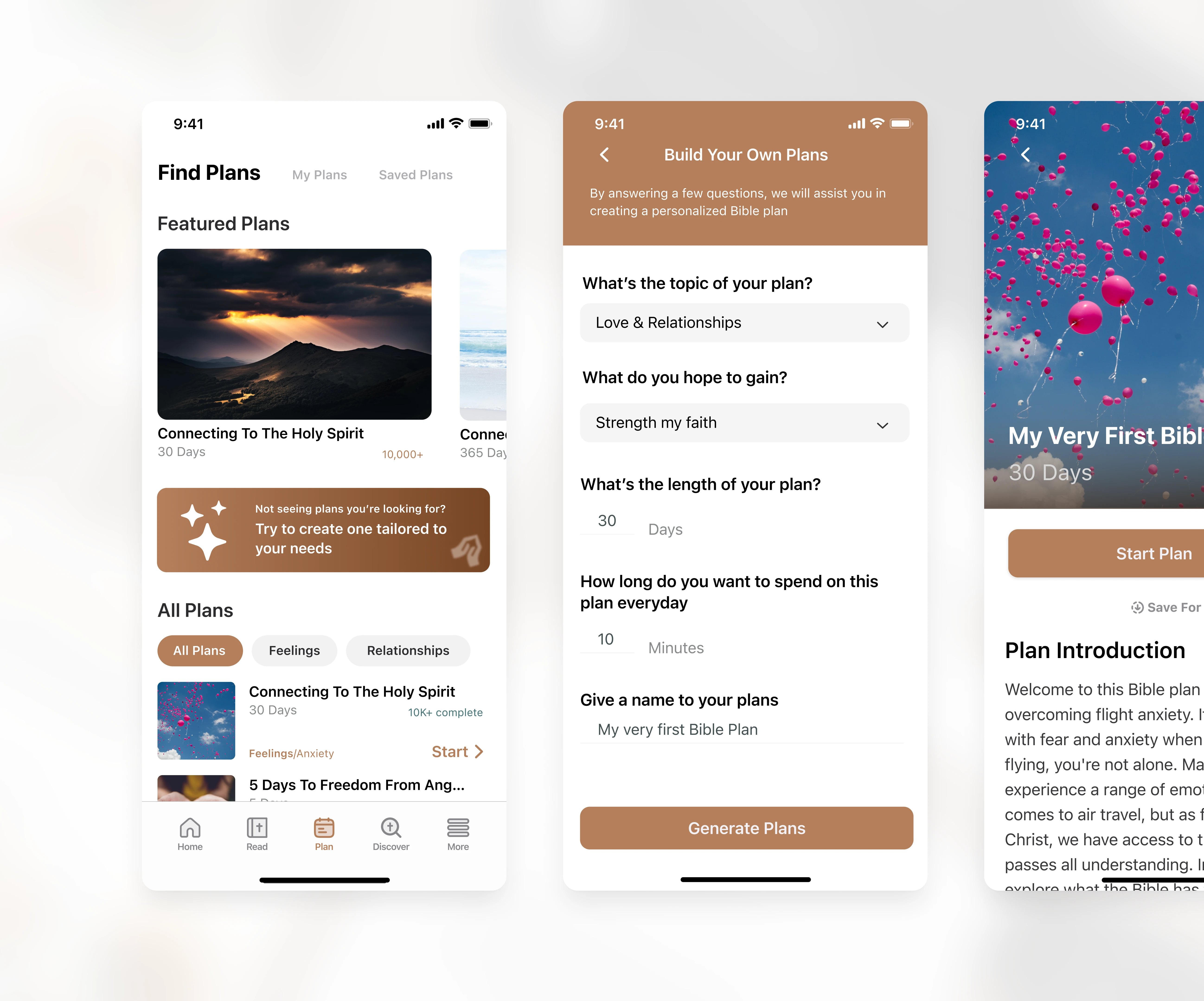
Scaling Content With AI & Trust
Because we couldn’t hire more writers, I explored using LLMs to generate personalized daily reading plans . I referenced the Google People+AI Guidebook to evaluate necessity and design the workflow .
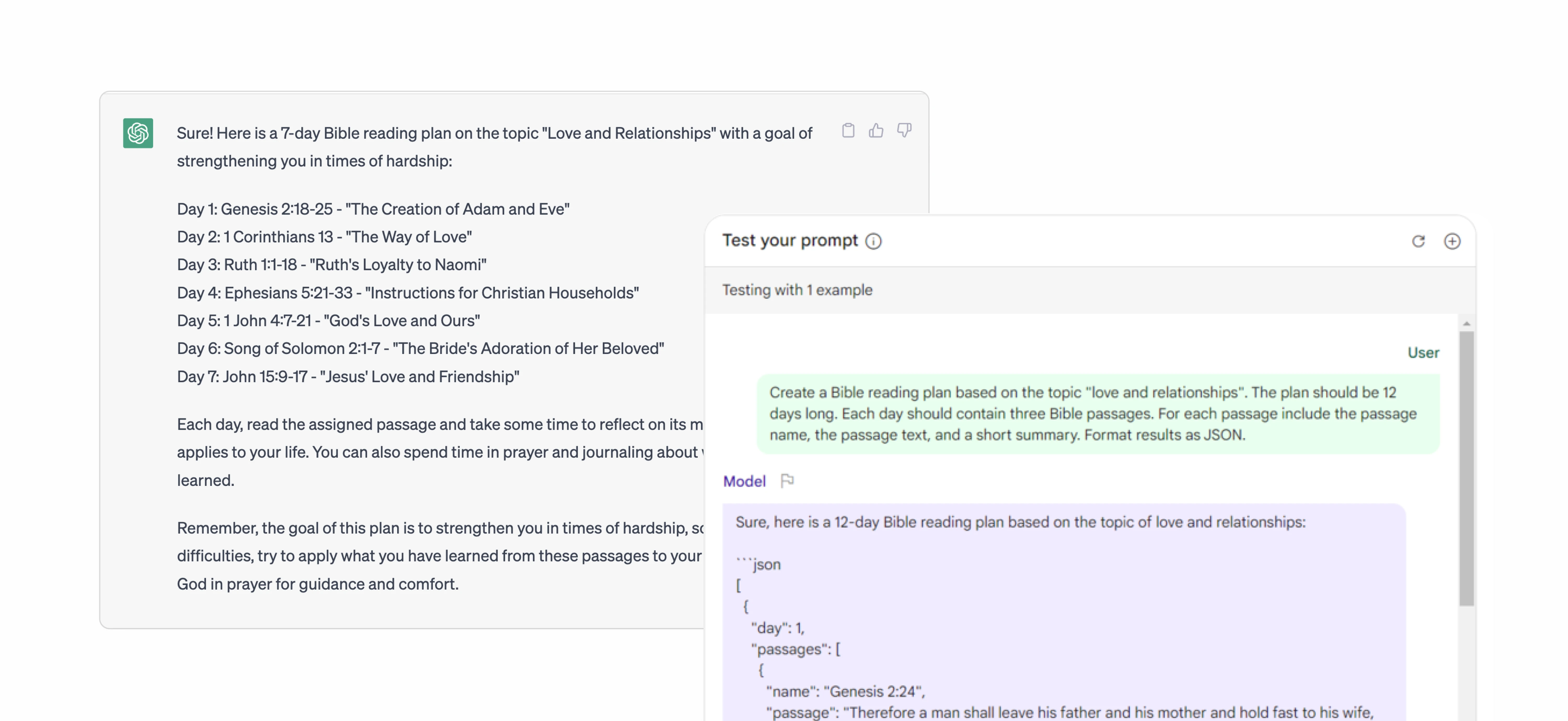
AI-powered Bible Plan Generation
I designed a “Build Your Own Plan” flow that asks users for their topic (e.g., “Love & Relationships”), goals, and daily time commitment . To build trust, the UI clearly sets expectations regarding the AI’s capabilities before generating the tailored JSON-driven content.
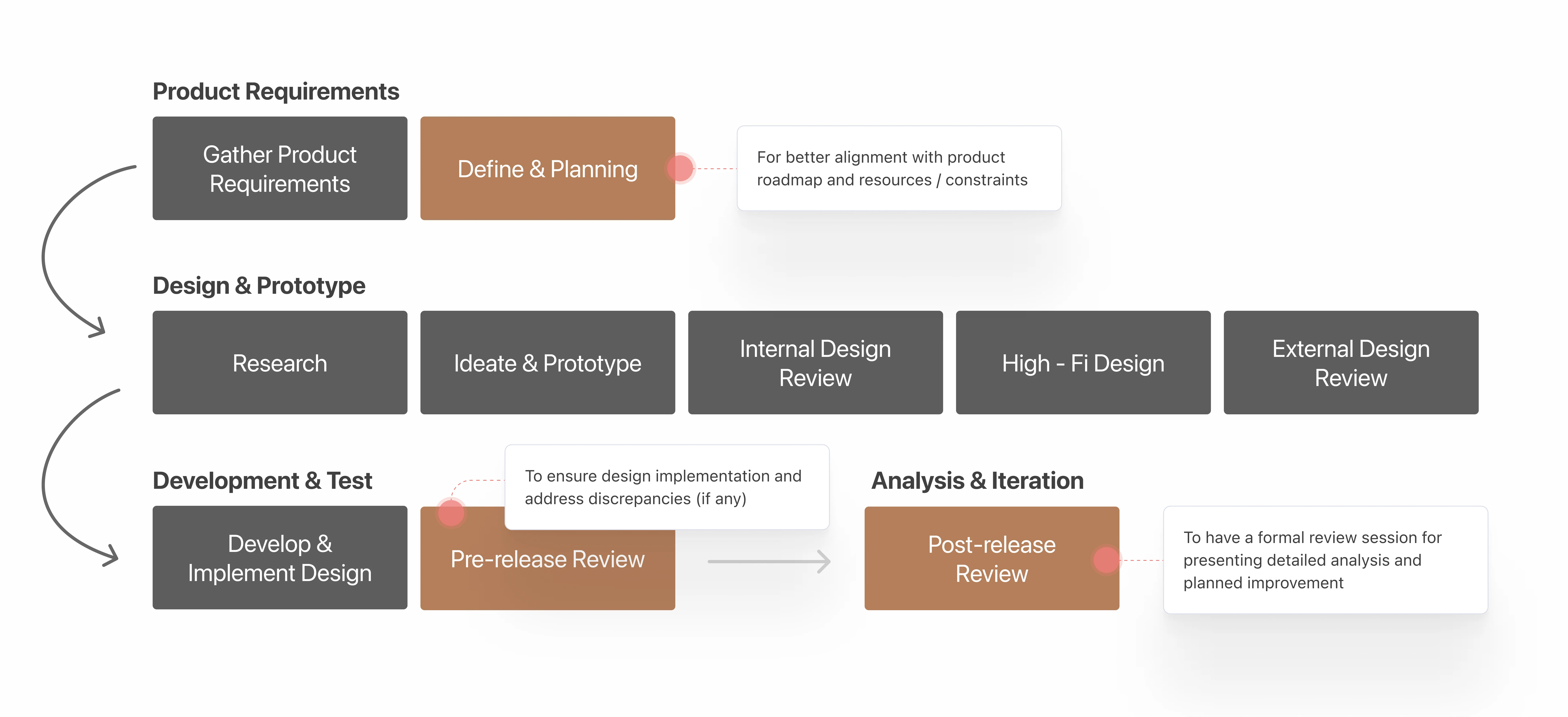
Elevating Organizational Design Maturity
A major pain point was the agile process itself: it lacked cross-functional communication and focused on quantity over quality .
The Process Redesign
I introduced three mandatory checkpoints into our lifecycle: a “Define & Planning” phase for roadmap alignment, a “Pre-release Review” to catch engineering implementation discrepancies, and a “Post-release Review” to analyze metrics . This gained stakeholder trust and vastly increased design visibility .